Created by: Federico Comitani
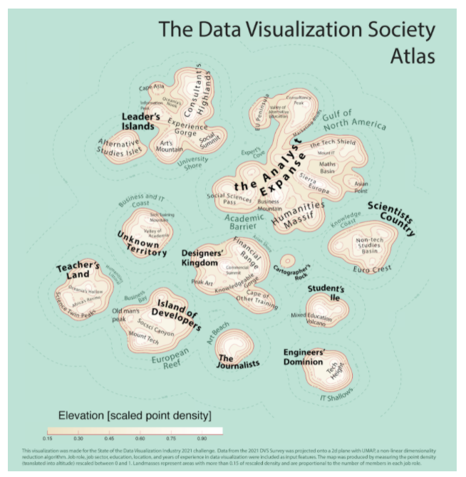
A general overview of the DVS community in 2021 and how it changed. The data is presented as a cartographic map, with landmasses representing DVS members who gave similar answers to the survey. Four panels further focus on specific aspects: the level of experience of members is represented as a temperature map, their education is represented as territories, changes observed with respect to the 2020 survey are presented as migration flows; finally, a heatmap illustrates the most common tools and charts.