explanatory

A matter of time: Linking job titles to data visualization tasks

Created by: Martina Dossi

1st place explanatory

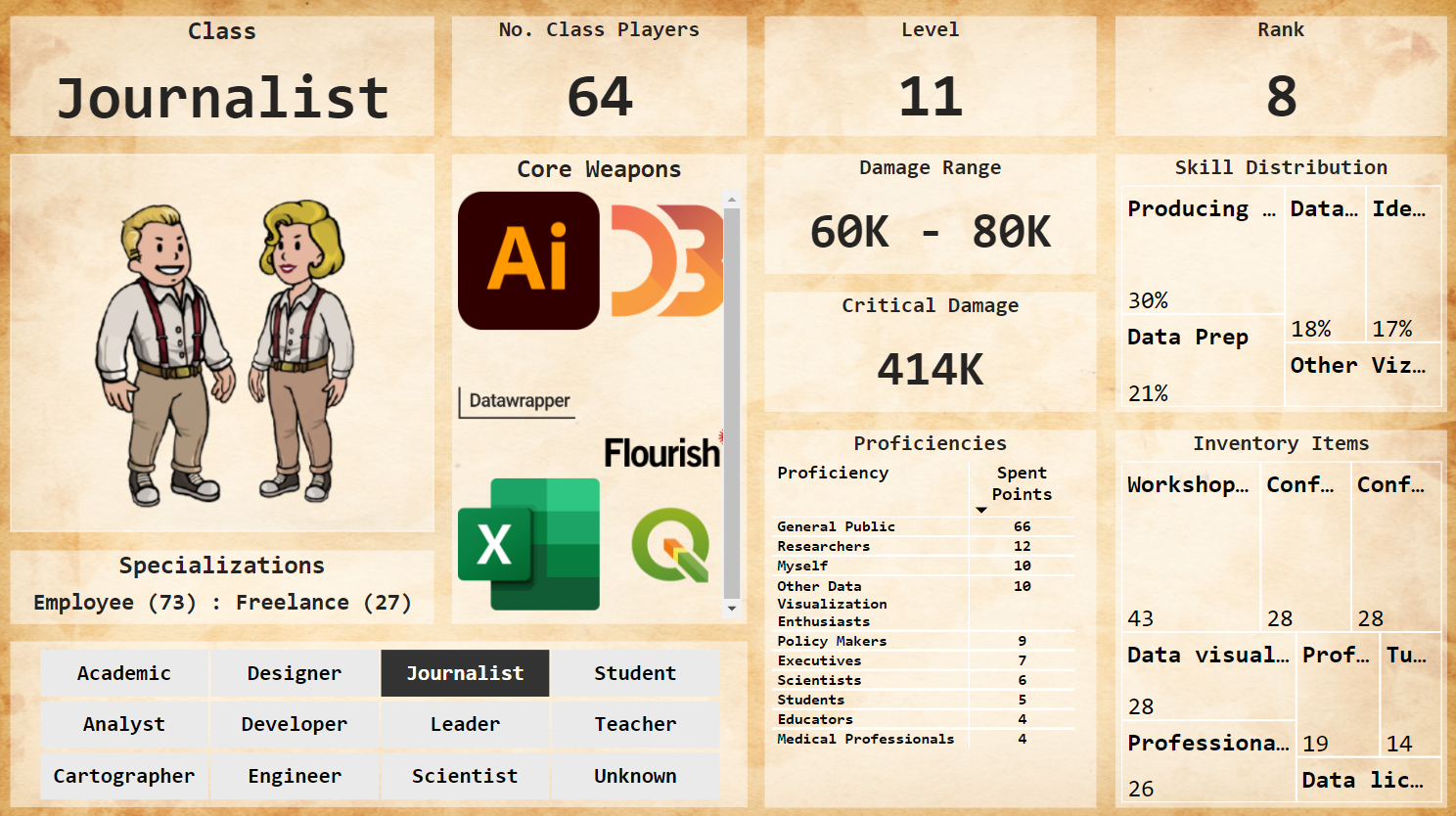
The visualization focuses on the relationship between data visualization tasks and job titles in terms of dedicated time. It has been submitted as explanatory visualization given the presence of many plots showing overall trends and relationship that should guide the reader through the complete story. The purpose of the analysis is to investigate how different professional roles are related to data visualization tasks in terms of devoted time, answering question such as: 'is there any difference in how time is allocated to different activities between job titles?', 'which role spend more time in each task?', and 'what are the other tasks explicitly specified in the dedicated field?'.

​Link to Visualization

10 Infrequent Ways to Distribute Your Time in Dataviz

Created by: Liz Bravo

2nd place explanatory

The 2021 Data Visualization SOTI Survey was taken by over 2,100 people. One of the questions was: Thinking back over your most recent workweek, how much time did you devote to the following aspects of data visualization? The question had five possible responses about the lapsus of time in every aspect of data visualization. 

 Diving in all answers, I was curious about the unique, rare, or unusual time distributions because I like combining data and thread; hand-sewn is one of my favorite techniques to visualize. Producing data visualization stitch by stitch takes much time.

Link to Visualization

Are there coworkers like me?

Created by: Sarina Chen

Third place, explanatory category

Since the pandemic, people have been switching jobs to accommodate their change in routine, living situation, or life priorities. Whether it be in-person or remote, onboarding in a less social environment could feel pretty lonely. It's difficult to meet new people with similar interests. This graphic compares people in the workplace and identifies groups of people that have similar roles, years of experience, and industry.

Link to Visualization

The Data Visualization Society Atlas

Created by: Federico Comitani

A general overview of the DVS community in 2021 and how it changed. The data is presented as a cartographic map, with landmasses representing DVS members who gave similar answers to the survey. Four panels further focus on specific aspects: the level of experience of members is represented as a temperature map, their education is represented as territories, changes observed with respect to the 2020 survey are presented as migration flows; finally, a heatmap illustrates the most common tools and charts.

Link to Visualization

Knowing the Family

Created by: Mala Deep Upadhaya

A little explanatory and a little exploratory work which tries to find the answer of following questions: Who is the driving force behind the Dataviz community? Where do they live? Who motivates them to keep going? Which industries are they influencing with their expertise? How much time and effort do they invest in data visualization? Do they have DVS membership? and we'd want to meet them.

Link to Visualization

Data Viz Roles' Salary and Gender Balance

Created by: Verena Schrader

When considering becoming a data visualization designer or switching roles within field, a question that comes into one's mind is how high is the earning potential. This question was the starting point for analyzing the data. Another goal was to evaluate gender balance.


The DVS Survey 2021 data has been used to create the visualization. The first part, the flowing sankey diagram, shows that salaries vary greatly, based on the different roles. The second half shows the percentage of women and men in the respective salary ranges. The amount of diverse data was too small to be shown in the diagram.


The result shows that the salary depends not only on the working field and role, but also on gender. The visualization illustrates that the balance is not yet finished. Although gender equality has made great steps forward in the past few years, one can see that there is still room for improvement.

The fonts and colors used in the diagram are accessibility tested and should also work for people having any kind of color blindness. Furthermore salary information from the survey results were summarized to ranges to make the chart easier to understand.

Link to Visualization

Freelancers and Employees in the Data Visualization Industry

Created by: Kristin Baumann

Wherever you look, data is getting collected in one way or another. Therefore the need to find insights in large data sets and make them easily understandable using visualizations is constantly on the rise. More people are joining the data visualization industry and have to decide how they want to work in it. What are the differences between freelancers and employees?

Link to Visualization

Who Do We Create Data Visualizations For?

Created by: Elie Francis

We asked our members in 2021 to tell us who they created data visualizations for in their organisation or (freelancers) for their clients. The results have been ranked from most-to-least selected audience category - showing both employees in organisations and freelancers. 2021 rankings have also been compared to results from 2020 survey.

Link to Visualization

Do Your Leaders Know Your Worth?

Created by: Kenon Vinson

Results mapped to a Likert scale from the question "To what extent do you agree or disagree: Leadership in your organization has a strong understanding of the value of data visualization" are visualized to reveal the extent to which professionals from different sectors agree or disagree to the statement.

Link to Visualization

Relation of Roles

Created by: William Careri

In the annual Data Visualization Society’s survey, 72% of respondents declared themselves as working either in-house or as a freelancer. Between the two, a wide range of roles appeared. This graphic illustrates the distribution of their respective roles and backgrounds.

Link to Visualization

Show Me The Money

Created by: Matthew Osborne, PhD

Yearly salary is a crucial consideration for anyone considering a career field. The DVS annual census seemed like an excellent data source to explore this aspect of data visualization careers.

This particular graphic explores yearly salary as a function of gender and data visualization experience. While there are a larger number of women with a wealth of data visualization experience, for any experience level below 16-20 years the distribution of female salaries appears to be shifted slightly below that of men.

Link to Visualization

Why Do We Do Dataviz

Created by: Guillermina Sutter Schneider - Data Scientist

Many many times I have found myself late at night cleaning up some random dataset in order to create a data visualization about it. And I did it just for the enjoyment. Data visualization makes me happy and I could spend hours and hours doing it. From the very first sketch to picking the grain intensity of the canvas background or fixing the drop shadow, I enjoy every single step of it.

I have always wondered how other dataviz practitioners felt while creating a data visualization: do they also do it because they enjoy it? Do they do it to build a portfolio or to build a particular skill? These questions made me want to find out more about how many hours other people spend doing it and why they do it.

Link to Visualization

Data Viz Society Influencers

Created by: Jasna Dishlieska Mitova

Frequently seeking inspiration myself, I decided to focus this visualisation on the data viz go-tos in our society based on the DVS Annual Survey 2021. This visual shows the 15 most influential people and non-generic resources based on the number of mentions in the survey. If 15 is not enough to get you inspired, there is the extensive list of everyone mentioned as well.

Link to Visualization

This is How We Viz

Created by: Amber Reed

An explanatory infographic based on results from the 2021 SOTI survey. The intent of this dashboard was to shine light on the individuals responsible for creating the data visualizations we know and love; answering the who, what, where, and why we do what we do. This dashboard was created in Tableau with considerations to accessible color palettes.

Link to Visualization

What's Stopping Us?

Created by: Creater

Question 38 of this years survey asked, ‘What current or recent barriers have you faced in getting into data visualization professionally?’, to participants who had less than 5 years experience, this was done ‘…in order to focus on early-career and new-to-field challenges.’ Participants were given a free text field to state the barriers they faced and after combing through those I categorized them into 14 themes that summarized the main areas that people experienced difficulties in and highlighted some additional findings.

Link to Visualization

Why We Visualize

Created by: Ilena Peng

Many online data visualization communities center around personal projects and challenges, like #TidyTuesday or this annual Data Visualization Society challenge. These works are created on one’s own initiative, without any outside pay. According to DVS' 2021 State of the Industry survey, the top two reasons for pursuing unpaid side projects were to build skills and for enjoyment.

In the survey, respondents were given five phrases and asked to identify how much each phrase reflected their motivations for doing unpaid side projects. This graphic shows the responses of 239 DVS members, with color corresponding to how much they resonated with each phrase and size corresponding to the number of people who answered as such.

Link to Visualization

Getting the Word Out

Created by: Lisa Vissichelli

Data visualizations are gaining popularity and industries are demanding a wider range of ways to get the word out. This year’s DVS census shows that industries are evolving how they share data visualizations. Of the top three communication methods, Dashboards, Presentations and Document or Report emerged as the highest use cases. This graphic illustrates how industries prefer communicating data visualizations by method.

Link to Visualization