

CREATED BY: Francois Dion - fdion@dionresearch.com
DESCRIPTION:
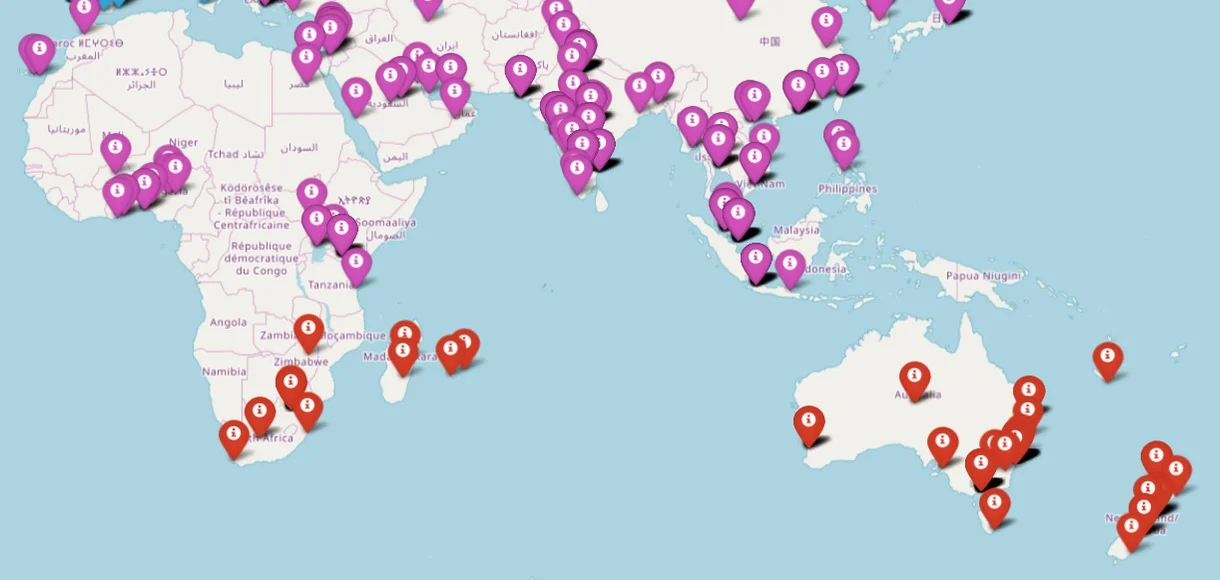
Mapping all signups as lat/long on a map, marker color is based on the clustering. Clustering is automatically calculated and optimal number of clusters selected. North America (green) and Europe (blue) signups are on a different scale.
PROCESS FOR CREATION:
This was mostly a machine learning effort, more than a visualization effort. This is using leaflet for the interactive map. The feature is part of a data quality tool I built for all the data science work I do.