

CREATED BY: Tiffany France
PROCESS FOR CREATION:
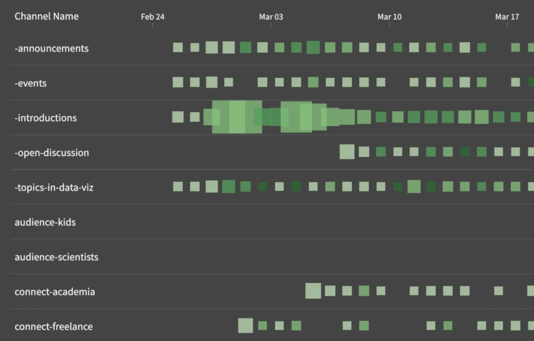
I was interested in seeing this data laid out in a Github-style commit heat map. I started there, then deconstructed the chart into a row. I had several objectives from this data - 1. Easily see all channels and be able to use as a reference guide 2. Find out which location is most active 3. See when channels were added, gained/lost traction 4. Show popularity by day to highlight potentially interesting topics 5. Show user engagement based on reactions + comments