Created by: Penelope Privett
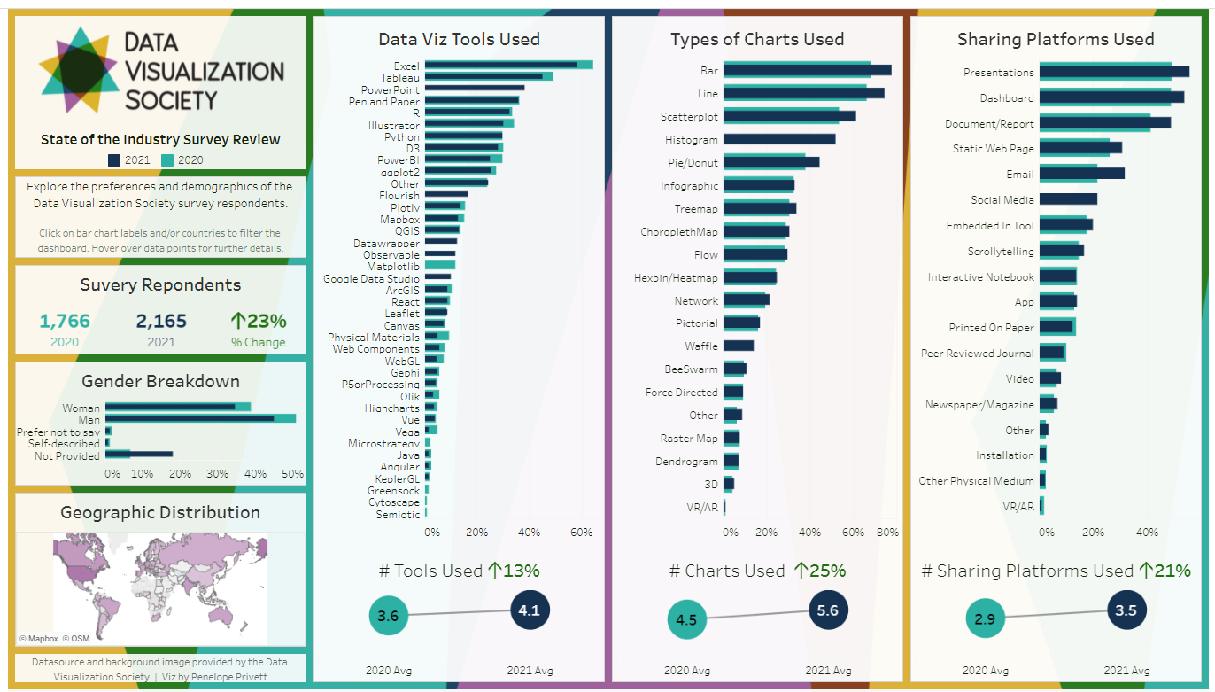
I have taken the 2020 and the 2021 survey results and compared the gender and location of the respondents against their preferences for tools, chart types and sharing channels.
The questions I've chosen to review were formatted as a "Select All That Apply" questions. I have compared the average number of options selected by the respondents, as well as the percentage of respondents that selected each option. Each of the comparisons show that the average number of tools, charts and sharing channels used have increased from 2020 to 2021 and that the most popular options from each question has not changed from year to year, but increased in usage.
The dashboard is also designed so that users can delve deeper into the results, by comparing smaller cohorts too see what their preferences are. For example, you could compare whether women living in Australia who use Excel have the same preference for bar charts as men who live in Sweden.