

CREATED BY: Alexander Koch
DESCRIPTION:
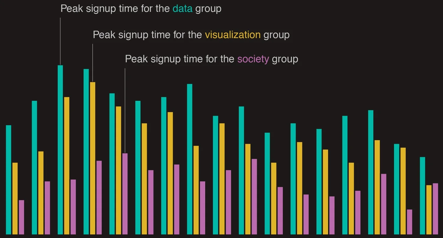
At what time of the day did people join the Data Visualization Society (DVS)? And can we see a difference between the self-assigned groups?
The visualization shows the number of signups at each hour of the day (local time) for each of the three DVS groups (data, visualization, society). A person was assigned to one of the three groups based on the highest of the self-assigned scores. All three groups appear to have similar distributions, though the peak signup time gets progressively later from the data group, over the visualization group, to the society group. I'll leave the interpretation to the viewer!
PROCESS FOR CREATION:
I wanted to see at what time of the day people signed up for the DVS. Because the timestamp in the challenge dataset corresponded to US Eastern time, regardless of the timezone of the person that signed up, I had to recalculate the time of signup to the local time in everyone's respective timezone. I did this using the latitude and longitude available in the dataset. From there on, all that was left to do was count the number of people in each of the three groups at each hour of the day and generate a grouped bar plot. I did everything in R and the code is available here: https://github.com/akoch8/dataVizSociety/blob/master/01_signupByHour.R