

CREATED BY: Philipp Koytek (@p4dataviz)
DESCRIPTION:
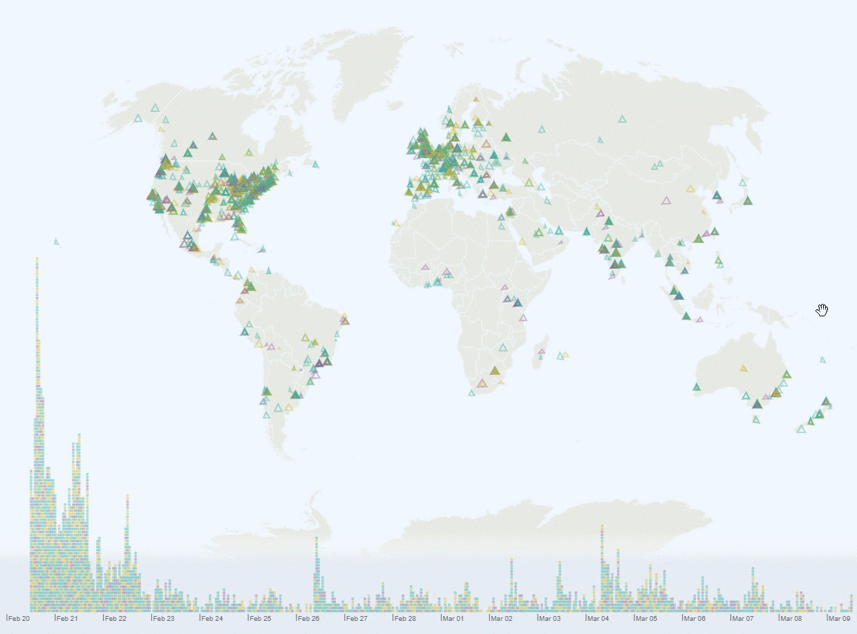
My goal for this challenge was to make an interactive and explorative visualization, so please feel free to explore: eg. how many people come from your area?
How to read:
Each dot/triangle represents one DVS member. The color shows their highest ranked category (data: green, visualization: yellow, society: purple).
The triangles corners encode the value of each category: top is data, right is visualization, and left is society).
How to interact:
On the timeline, you can click to select all signups of a specific hour or brush to select more.
On the map you can click on a "populated" location to select all signups in this location or make a lasso selection of multiple triangles on the map (while holding shift).
WIP:
Right now this is still a work in progress. As this was basically my first time using canvas, things took a little longer. I didn't find the time to make a more elaborate and self-explanatory visualization before the submission deadline, but I do plan to still add a title, an explanation how to interact and some annotations. So stay tuned ;)
PROCESS FOR CREATION:
first sketching, then made with d3 and javascript and html canvas.