home
Memberships
General Membership
Institutional Memberships
News
For Members
Member Portal
Dataviz Research Recruitment
Slack Community
Programs
Outlier
Mentorship
Dataviz Events Calendar
Reports
State of the Data Viz Industry Survey
Challenges
Affiliated Groups
IIB Awards
Nightingale
Order Nightingale Magazine
Nightingale
Write For Nightingale
Digital Version of Nightingale Print Magazine
Jobs Board
About
Mission
Support DVS
Board and Council
Committees
Nominations
Work With Us

Data Visualization Society

home
Memberships
General Membership
Institutional Memberships
News
For Members
Member Portal
Dataviz Research Recruitment
Slack Community
Programs
Outlier
Mentorship
Dataviz Events Calendar
Reports
State of the Data Viz Industry Survey
Challenges
Affiliated Groups
IIB Awards
Nightingale
Order Nightingale Magazine
Nightingale
Write For Nightingale
Digital Version of Nightingale Print Magazine
Jobs Board
About
Mission
Support DVS
Board and Council
Committees
Nominations
Work With Us
The Data Visualisation Toolkits
November 9, 2019
exploratory
Guest User
The Data Visualisation Toolkits
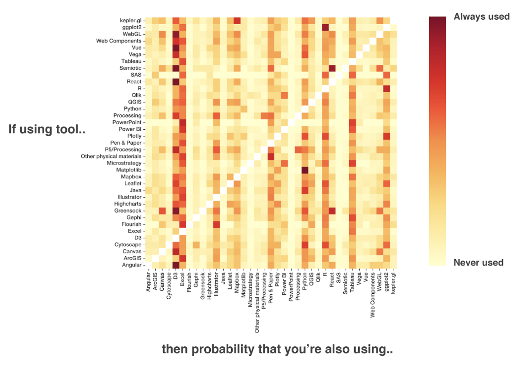
Guest User
November 9, 2019
exploratory

The Data Visualisation Toolkits

Guest User
November 9, 2019
exploratory

CREATED BY: Madison Cotteret

DESCRIPTION:

A study of which data visualisation tools are commonly used together

tool_info - Alex Madison.png

Tagged: map, plot, python, hand-made, sick

Newer PostThe Garden
Older PostSemantic Scatterplot- BERT Directed Layout
Back to Top
datavisualizationsociety@gmail.com

Code of Conduct | Bylaws | Privacy Policy | X | Bluesky | Instagram | LinkedIn | YouTube | Merch Store | Brand Guidelines | Contact us