

Executive Summary
The 2022 SOTI survey was disseminated online between 01 September and 08 October 2022. Distribution mechanisms included an email announcement and series of reminders from the official DVS email address, an announcement in Nightingale (the DVS publication), a series of posts on the DVS Slack, and numerous social media posts (e.g., Twitter, LinkedIn) from DVS and others (e.g., Meetup Groups).
Who are we?
Respondents to the 2022 SOTI survey include DVS members (57.5%) and non-members (42.5%; “no” or “don’t know” responses), representatives from over 50 different industries, and visualizers from 77 countries, spanning all six populated continents [Figure 1]. Among the 1,218 respondents who identified their city or town, the top ten locales globally were New York City, London, Washington DC, Chicago, Seattle, Boston, Paris, San Francisco, Los Angeles, and Bengaluru.
Figure 1. Maps of Survey Respondents (counts)


Other cities with substantial representation (at least 9 respondents each) include Toronto, Montreal, and Vancouver in Canada; Sydney and Melbourne in Australia; Moscow in Russia; and Oakland (California), Atlanta, Denver, Philadelphia, Portland (Oregon), and Mexico City. The next most frequently represented cities in South America were São Paulo and Buenos Aires; Berlin and Oslo in Europe; Mumbai in Asia; and Kampala in Africa.
Aside from the United States, the United Kingdom, and Canada, who have held the top three spots each year, respondent representation by country [Figure 2] has shifted over time. India has increased participation while other countries such as Australia, Germany, and Spain have had more variable participation ranks over time. In 2022, India, Germany, Australia, Brazil and France, Spain, and the Netherlands round out the top ten, in order.
Figure 2. Rank of Countries by Total Respondents Over Time (per year by counts)

A few other countries with variable participation in the survey over the years, sometimes appearing in the top ten, include Italy, New Zealand, Mexico, and Russia. Both the 2021 and 2022 surveys had all the same countries in the top ten, though the order of ranks five through nine shifted slightly.
In addition to location, data visualizers are also diverse in the languages they speak. Over one in three respondents who answered this question identified languages besides English, and we collectively listed over 60 distinct languages [Figure 3]. Bubble size and color indicates the number of visualizers who identified speaking that language. The nine listed by the most speakers are the same as last year’s top languages, with just a few minor shifts in rank: Spanish, German, and French are still the largest three, followed by Portuguese, Italian, Hindi, Russian, Dutch, and Chinese.
Figure 3. Non-English Languages Spoken by Data Visualizers (counts)

Languages not represented in 2021 include Amharic, Bosnian, Estonian, Kikuyu, Latvian, Luhya, Malagasy, Mongolian, Twi, Wolayta, and more. The proportion of data visualizers who speak non-English languages was nearly identical in 2022 and 2021: 36–37% of respondents who answered this question and 28% of everyone who took the survey.
Survey respondents represent many different backgrounds, experiences, and perspectives. Of the 1,248 respondents who answered the question about gender, 50.1% identified as women, 48.5% identified as men, and 1.4% preferred to self-describe. The survey also collected information on whether respondents identified as LGBTQ+ and if they considered themselves a part of a historically disadvantaged or underrepresented racial or ethnic group. Of the 1,266 participants who responded to one or both questions, 24.2% identified as part of one or both groups [Figure 4].
Figure 4. Respondents Identifying as LGBTQ+ or from a Historically Disadvantaged or Underrepresented Racial or Ethnic Group (percent of respondents)
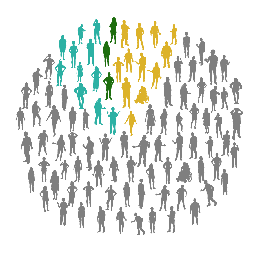
Among the 86 respondents who self-described their underrepresented group, 49 mentioned groups in the United States and 26 identified as part of groups around the globe. Some indicated they are Indigenous or Native to their respective regions, others noted religious or cultural affiliations, and a few respondents provided examples of contexts or situations in which they feel underrepresented. Shape, size, action, or wheelchair status of icons are not meant to reflect survey respondents but included to demonstrate diversity in data visualizers.
Who are we?
DVS 2022 SOTI survey respondents currently live in 77 countries, speak over 60 languages, and are a part of countless cultures from across the globe. We are men, women, and individuals who prefer to self-describe. One in four of us identify as part of the LGBTQ+ community or from a historically disadvantaged or underrepresented racial or ethnic group.
What roles do we occupy and in what contexts do we work?
The 2022 survey received 1,568 responses to its opening question: “Which of the following describes your role as a data visualizer in the past year? Select all that apply.” Echoing the 2021 and 2020 surveys, this question listed six options: four paid capacities plus two unpaid. The vast majority of people chose one or more paid capacities. Figure 5 shows how the two most common—Employee (“Position in an organization”) and Freelance (“/Consultant/Independent contractor”)—were chosen by roughly 3 out of 4 and 1 out of 5 data visualizers respectively.
Figure 5. Data Visualization in Mostly Paid Capacities (percents and counts)

Only 8% of respondents indicated that they do data visualization exclusively in unpaid capacities (as a Hobbyist and/or Student). This total stands in striking contrast to the nearly 40% of respondents who chose Hobbyist (31%) or Student (6%) for “Which role best describes you?” in the 2021 State of Dataviz Survey by Observable. But it is quite similar to the 7% of respondents who chose just Hobbyist or Student in the 2021 and 2020 DVS survey populations.
Respondents who chose Employee or Freelance were asked which of nine roles most closely aligns with their job and whether data visualization constitutes the primary focus of their work, an important secondary part, or neither. The overall share of respondents who identify data visualization as their primary focus has increased slightly, from 30% in 2020 to 34% in 2021 and 35% in 2022. Figure 6 shows that this share is consistently higher among Freelance than Employee respondents (approximately 1 in 2 vs. 1 in 3 in both 2022 and 2021), but also varies by role type. Among analysts (the largest group, with nearly 500 respondents), about 1 in 4 do data visualization as their primary focus.
Figure 6. Primacy of Data Visualization by Role Type (percents)

Respondents who chose Employee (“Position in an organization”) were also asked about the context (sectors and/or industries) of their organizations. Figure 7 shows how role types intersect with organizational contexts. Box size corresponds to the number of respondents at a given intersection. Analysts are well represented in every sector and in most industries, with the exception of journalism. Leaders (the second largest group, with nearly 200 respondents) are also found in every area, but with different relative distributions. As in 2021, analysts in the public sector slightly outnumber those in non-profit and private contexts, and academia has more analysts than consulting. By contrast (again matching 2021), more leaders are doing data visualization in consulting than academia, and fewer in the public sector compared with private or non-profit contexts.
Figure 7. Data Visualizer Roles by Sector and Industry (counts)

The job titles that correspond to each role are as varied as the individual visualizers themselves. Respondents are data scientists, analysts, academics, and researchers; graphic designers, data storytellers, journalists, reporters, cartographers, architects, biologists, engineers specializing in machine learning, business intelligence, and software, and developers with experience on the frontend, with software, and for data visualization. We also heard from leaders at all levels, including team leads, managers, those of senior status, presidents, directors, chiefs, and founders. Notably, 30% of respondents indicated a job title containing the word “data,” 24% held a job whose title contained “analyst,” “analytics,” or “analysis,” and 10% reported a job title with some form of “visual” in the name (e.g., visualizer, visualization), all similar to the 2021 titles. Around 10% had titles related to “art” or “design,” another 10% were related to “developer” or “engineer,” and 5% indicated a role in “business intelligence.” There are also more roles like “Data Experience Design Engineer,” “Head of Data Insights,” and “Visual Information Designer.” This variety in titles demonstrates the breadth of our global data visualization community.
Knowing that where and how we work has changed dramatically in the past few years, we wanted to better understand the situation data visualizers find themselves in and whether or not they are happy with their current work arrangement - be it on site, remote, or a mix of the two. More than half (54%) of survey respondents who answered a question about employment told us they are currently working remotely; around one in 10 are on site (12%); and a third are working in a hybrid way (34%). While 70% told us that they like their current work arrangement (whatever it may be), 14% would prefer more opportunities to interact regularly with colleagues in-person, and 16% would prefer less.
Figure 8. Current and Preferred Work Arrangements (percents)

What roles do we occupy and in what contexts do we work?
DVS 2022 SOTI survey respondents are analysts, leaders, engineers, scientists, and journalists. We work in the public sector, for non-profits, in academia, and as freelancers and consultants. Our job titles show how varied and broad our day-to-day work likely is and demonstrates that our community has visualizers across all levels of leadership. This year we also learned about where we work and that close to one-third of us would prefer a different arrangement.
How do we spend our time and how much do we make?
It’s always interesting to peek over at someone else’s data visualization practice to see what they’re up to and how long they’ve been at it. One item we’ve asked across each year of the survey is how many years of data visualization experience we have. The ridgeline plot in Figure 9 shows the increases over time in the proportion of more seasoned data visualizers. The highest proportion of respondents to this year’s survey have between six and ten years of data visualization experience.
Figure 9. Years of Data Visualization Experience over Time (percents by year)

Over time we expect these latter categories to grow; that is, if people continue working in the data visualization space. We can already notice a higher proportion of respondents in the 16-20 year category and above. Understanding the shifting distributions of data visualizers can help inform what types of resources might be helpful. A seasoned data visualizer may need different support than someone relatively new to the field.
Another feature of someone’s data visualization practice that might be helpful to understand is how much time they spend on different types of tasks. The series of six radar charts in Figure 10 bring some of these practices to light. The first feature to notice is that most visualizers spend fewer than ten hours on any type of task in a given week. Logically, this makes a bit of sense. There are only so many hours in a week, and unless your primary focus is in one of these specific domains (i.e., ideating, data prep, data analysis, producing visualizations, managing data visualization tasks, or other visualization tasks), it’s unlikely in a given week we’d see too many people spending upwards of 20 hours on a type of task.
Respondents reported spending the most time producing visualizations, it has the highest proportion (18%) indicating spending 11 to 20 hours in the prior week. For people interested in data visualization, this can be the most rewarding part of the process, so it’s probably a good thing we’re spending more time here.
Three of the categories of tasks stick out as having the most “none” responses where people are spending no time: ideating (27%), managing data visualization tasks (37%), and other visualization tasks (52%) . First, ideating. The exercise of thinking about how to visualize data and iterating on different possibilities may not be a part of everyone’s practice, or, in the case of those working for an organization, they may not have time or support from leadership to design different visualizations. The managing visualization tasks category is new this year, and while over a third of respondents said they don’t do this, another third (35%) indicated they’re spending up to 5 hours per week in this management space. Understanding and documenting the scope of visualizers’ time is important to normalize how we are working and what it takes to produce quality visualizations.
Figure 10. Relative Hours Spent on Data and Visualization Tasks (percents)

Though not always considered “polite” conversation, being transparent about compensation can help professionals establish their rates and advocate for what their time is worth. Figures 11 and 12 display six graphs each; Figure 11 focuses on annual compensation and Figure 12 shows hourly compensation to account for the different types of income visualizers might have. Within each figure there are three sets of streamgraphs, one set showing compensation breakdown by gender, the second by whether respondents identify as a part of the LGBTQIA+ community, and the third by whether respondents identify as part of a historically underrepresented racial or ethnic group. The top streamgraph is of a traditional format, with stacked area data centered around a horizontal center line. The bottom is an expanded streamgraph, essentially a stacked area chart where responses are shown as a proportion of the whole 100% within that income category.
Figure 11. Annual Compensation by Gender (proportion of respondents)

The overall median of the annual compensation graphs is at $60,000 to $79,999 per year, with very few respondents reporting over $159,000 per year, and a small but notable increase in the number of respondents reporting annual compensation in the $240,000 per year or more category.
The set of gender streamgraphs have an interesting story to tell. In the more traditional streamgraph view, it appears that men and women are relatively symmetric. That is, of the people making a certain amount of money, it looks like about half are women and half are men. Indeed, the median for both men and women are in the $60,000 to $79,999 range; the median for respondents who preferred to self-describe is lower, in the $40,000 to $59,999 range. In the stacked area chart we also notice in the tail (above $159,999), with the exception of the highest income category mentioned previously, the respondents are nearly all men.
WIthin the LGBTQIA+ and underrepresented racial or ethnic group breakdowns, the data show some mixed findings. The median income for LGBTQIA+ and underrepresented racial or ethnic groups is lower than the overall median at $40,000 to $59,999. Both groups have some representation in the higher income categories, but still have proportionally fewer respondents.
The data for hourly compensation are similar, though there are fewer respondents and a bit more variation across income categories. The overall median is between $60 to $74 per hour. The median hourly compensation for women is higher at $75 to $99 per hour, while the median for those who preferred to self describe was $15 to $29 per hour. Women and men trade off who is most represented in the higher rate categories, with men having proportionately higher representation in the two highest categories, $275 to $299 and $300 or more per hour. No respondents who identified as part of the LGBTQIA+ community and reported hourly compensation indicated they made $175 or more per hour. The median hourly compensation for LGBTQIA+ respondents was $45 to $59.
Respondents from disadvantaged or underrepresented racial or ethnic groups also had a lower median hourly compensation at $45 to $59. Some respondents indicated higher hourly compensation at $200 to $224 and $250 to $274 per hour, though other respondents indicated hourly compensation of less than $15 per hour.
Figure 12. Hourly Compensation by Gender, LGBTQ+ Status, and Historically Disadvantaged or Underrepresented Racial or Ethnic Group (proportion of respondents)

How do we spend our time and how much do we make?
Since the first survey in 2017, we are becoming increasingly seasoned as a community, but are also welcoming new data visualizers and fresh perspectives. Through the generosity and openness of respondents to our surveys, we are able to better understand how other data visualizers work and what their compensation looks like. Most of us spend at least some time during our week producing visualizations, usually ten hours or less, and also spend a lot of time preparing and analyzing the data. Collectively, we earn a median annual pay of USD $60,000–79,999 or an hourly rate of USD $60–74, the median annual pay is lower than respondents reported in the 2021 survey. Visualizers identifying as LGBTQIA+ or part of a historically underrepresented group reported lower median annual and hourly compensation.
How do we visualize and what challenges do we face?
Many questions about how we visualize, including what tools respondents in particular roles or work contexts use, which chart types dominate, and how we share our visualizations, can be answered with the public dataset through the State of the Data Visualization Industry 2022 Challenge. Here we focus on painting a broad picture of the kinds of technologies one might expect data visualizers to use [Figure 13], how much we collectively like the tools we use [Figure 14], and challenges encountered when using tools we did not choose ourselves [Figure 15].
During each of the four years that the Data Visualization Society has conducted this survey, the tools used by the largest share of respondents have been Microsoft Excel (#1) and Tableau (#2). Of note, three of the technologies most widely used for data visualization in 2022: PowerPoint (#3), Google Sheets (#6), and Figma (#12), only revealed their popularity clearly after being added to the 30+ listed survey options based on the previous year’s most frequent write-ins for “Other”.
Figure 13. Technologies Most Used in 2022 Compared with Three Previous Years (percent of respondents)

Among the consistently listed choices, R (+/- ggplot2), Python, and D3.js have maintained their relative ranks across four years, though each with a marked decrease in share of respondents. By contrast, PowerBI has risen from #9 in 2019 to #4 in 2022 (surpassing D3 last year, Python and R this year). Illustrator tied with pen & paper (#7) with 336 respondents each (25%).
This year was the first time this survey asked data visualizers how much they like the tools they use. Perhaps unsurprisingly, answers vary widely both between tool families and for specific tools within a family. Focusing first on the wider groupings [Figure 14a]: Google, GIS, and Microsoft tools are less well liked than those from other digital families. Topping the chart, a smaller, dedicated group of enthusiasts really like pen and paper as data visualization technologies.
Figure 14. Technologies Data Visualizers Like “Very Much” (counts and percents)


Zooming in on individual tools [Figure 14b], a few things become apparent:
Not all JS options are created equal. They span the entire list, with Svelte (one of the five data-informed additions to this year’s survey options), P5, and D3 cracking the top 10 favorite tools all the way down to Highcharts and WebGL in the bottom 10.
Families like R and Python are more consistent - their users like both ggplot and plotly just as much as the parent tools.
Three “other” (i.e. non-family) tools take up slots in the top 10 and nearly twice as many people like Tableau “very much” compared to Excel, the most used tool for the past few years.
Despite being somewhat ubiquitous when it comes to use, Microsoft tools are not well liked in comparison to other tool families. While PowerBI fares better in the middle of the pack (being “very much” liked by approximately as many users as Python), Excel and PowerPoint are in the bottom 10.
Google tools cluster down at the very bottom, along with Canvas (not Canva).
For a screen-reader friendly version of this table, please visit Public Report Data Tables for DVS SOTI 2022.
Respondents who identified as freelancers or employees within an organization were asked whether they are able to choose their own tools or, if their tools are chosen by others, what level of problems that causes. Those who reported some problems or major problems with tools chosen by others were asked to identify those problems [Figure 15].
For both freelancers and employees, the top challenge is that tools chosen by others were not the best fit for their task. Other frequently reported difficulties include inadequate options for customizing, difficulty integrating with other tools, and costs and/or license issues.
Figure 15. Problems Encountered When Tools Chosen by Others (counts and percents)

By comparison with respondents working within organizations, freelancers experience fewer difficulties with security or governance but more problems with insufficient support or poor documentation.
Figure 16. Top Challenges with Doing Data Visualization (respondent counts)

Respondents also indicated what challenges they face when doing data visualization [Figure 16] (n = 1,314). The most common challenge was lack of time, selected by 52.0% of visualizers who responded to this question. Learning new tools/approaches (36.9%), spending too much effort on non-viz activity (35.8%), and accessing data (34.9%) were the next most commonly selected responses. Overall the fewest respondents indicated facing challenges with the volume of data (17.1%), lack of collaboration (23.1%), or low data literacy (24.1%).
This year we asked respondents to rate the impact each of these challenges has on their work. Of those who rated significance after selecting “lack of time” 60.1% indicated it has a significant impact. Half (49.0%) of respondents indicated too much effort spent on non-viz activities as significantly impactful. Accessing data was rated as significant by 42.3% of respondents.
Each year we want to learn more about and support data visualizers who are new to the industry. They might face different challenges when learning new tools, best practices, and how to integrate data visualization into their process. Respondents with five years or fewer of data visualization experience were asked what current or recent barriers they have faced in getting into data visualization professionally; 335 individuals answered this question. There were four primary themes that emerged in these data and a set of minor themes.
The most mentioned barrier to entry into data visualization was around finding work and/or adequate compensation. These ranged from uncertainty of where to start, “not sure where / what to look for, how to get into the field professionally…” to frustrations that “Most job postings are for mid or senior level positions, requiring between 5-10 years of experience. There is a serious lack of appealing entry level jobs.” Still others indicated that the job postings are “looking for a data unicorn” that does all the data processing, analysis, visualization, and more when some are just looking for a data visualization-specific job.
Another theme surrounded lack of time or balancing data visualization with other life priorities. The barrier of time is associated with learning new tools, practicing visualization, engaging with the community, and networking. One respondent summed it up nicely, “Lack of time to dedicate myself to data viz and lack of opportunities to practice besides the job.”
Respondents also indicated having adequate skills or training as a barrier to entry into data visualization. Some responses mentioned specific skills, such as “Difficulty defining the audience and level of detail to include” and “Lack of skills in D3.” Most were more broad and are best summarized by “Lot to learn in an ever growing field” and “Increasing efficiency and quality of designs.”
The last major theme across early career respondents was finding adequate support for data visualization. For some this meant wanting more opportunities for networking and mentorship, others indicated challenges at different levels in their organization including “Management understanding of [data visualization] feasibility, no support on projects.
How do we visualize and what challenges do we face?
DVS 2022 SOTI survey respondents use a lot of different tools to accomplish their data visualization tasks. Across the past 4 years, Excel, Tableau, R/ggplot, and PowerPoint have been some of the most popular tools, though respondents report dozens of unique tools annually. Some less frequently used tools such as physical materials, Svelte, pen and paper, and P5 are the most liked tools; of the most selected tools, Tableau and R were more liked while Excel and PowerPoint were in the bottom ten. We do find it challenging when tools are chosen for us (e.g., by clients, or because of IT restrictions) as some tools are not a good fit for the type of data or visualization task. Overall challenges with doing data visualization often revolve around not having enough time and too much effort on non-data visualization tasks. Barriers to entry into data visualization were also time related, but this year more respondents emphasized not finding suitable employment or job responsibilities that align with their desires or skills.
Figure 17. Next Priority for Improvement Similar in 2021 and 2022 (percents)
When asked to pick one next priority, 96% of 2022 respondents indicated interest in improving skills with an existing tool (28%), a new tool (26%), in design (24%), with data (15%), or “other” (4%). As Figure 17 illustrates, these distributions are almost identical to last year’s priorities, with the exception that getting better with existing tools (now #1) has traded places with design skills (now #3).
Recurring themes among “other” responses include better storytelling, business strategy, fostering data literacy in organizations / among stakeholders, and wanting to prioritize multiple areas.
Only 4% of respondents chose “I don’t feel I need to improve my data visualization skills currently.”
To learn new data visualization skills, respondents reported that it would be most useful to “Work through a project” (81%) and engage with “Examples” (67%). As Figure 18 indicates, these two approaches have consistently topped the list, through four annual surveys.

How do we get better?
Data visualizers are continually looking to learn and improve, and the survey includes questions every year to understand our priorities for improvement, preferred methods of learning, and use of professional development funds.
By contrast, the third most frequently chosen option, “Video tutorials” (61%) has increased nearly 20% in popularity since 2019 (43%), when it lagged 12% behind “Collaboration with more skilled practitioners” (55%). In 2020, perhaps related to conditions fostered by the global pandemic, “Video tutorials” was the only learning method that increased in popularity, and its lead over “Collaboration…” has continued to widen in 2021 and 2022. Conversely, “Books”, which tied with “Video tutorials” in 2019 (43%), has dropped 10% in popularity over the same time period.
The most frequent write-ins by respondents who chose “Other” this year were blogs/online articles, structured online courses, online forums, and templates or code (yes, from online) to rework. Additional methods repeated among write-ins include good documentation, college/graduate courses, and challenges.
The relatively low ranking of “Workshops” on this list (appreciated by only 39% of this year’s respondents, relatively consistent with previous years) stands in striking contrast to their #1 position in Figure 21 on how data visualizers are likely to use professional development funds.
Figure 18. Helpful Methods for Learning New Data Visualization Skills
(percents across four years)

While men and women both prefer “Working through a project” above all else and like “Video tutorials” just fine, there are some interesting differences when we explore the rest of the data in Figure 19. Men are slightly more likely than women to prefer engaging with “Examples” and “Mentoring/teaching” others, and are much more likely than women to prefer learning through “Books”. Women, by contrast, are slightly more likely than men to prefer “Collaboration…” and far more likely to prefer a “Workshop”.
Figure 19. Data Visualization Learning Preferences Compared by Gender (percents)

The 2021 survey included two additional options (“in-person formats” and “virtual formats”) for the question, which are not covered in Figure 18 and Figure 19, about learning methods. This year, the survey separated these categories into their own questions about modes of delivery.
Figure 20. In Person or Virtual Training for Data Visualization (percents for women and men)

Responses indicate that many more data visualizers consider themselves likely to attend training virtually (over 70%) than in person (under 40%). The difference between synchronous and asynchronous virtual options, by contrast, is fairly small (a difference of less than 6%). Comparing responses by gender suggests that in-person training is preferred by slightly more men than women, while virtual training of either variety is slightly favored by women. But the overall similarities are stronger than these small differences between gender.
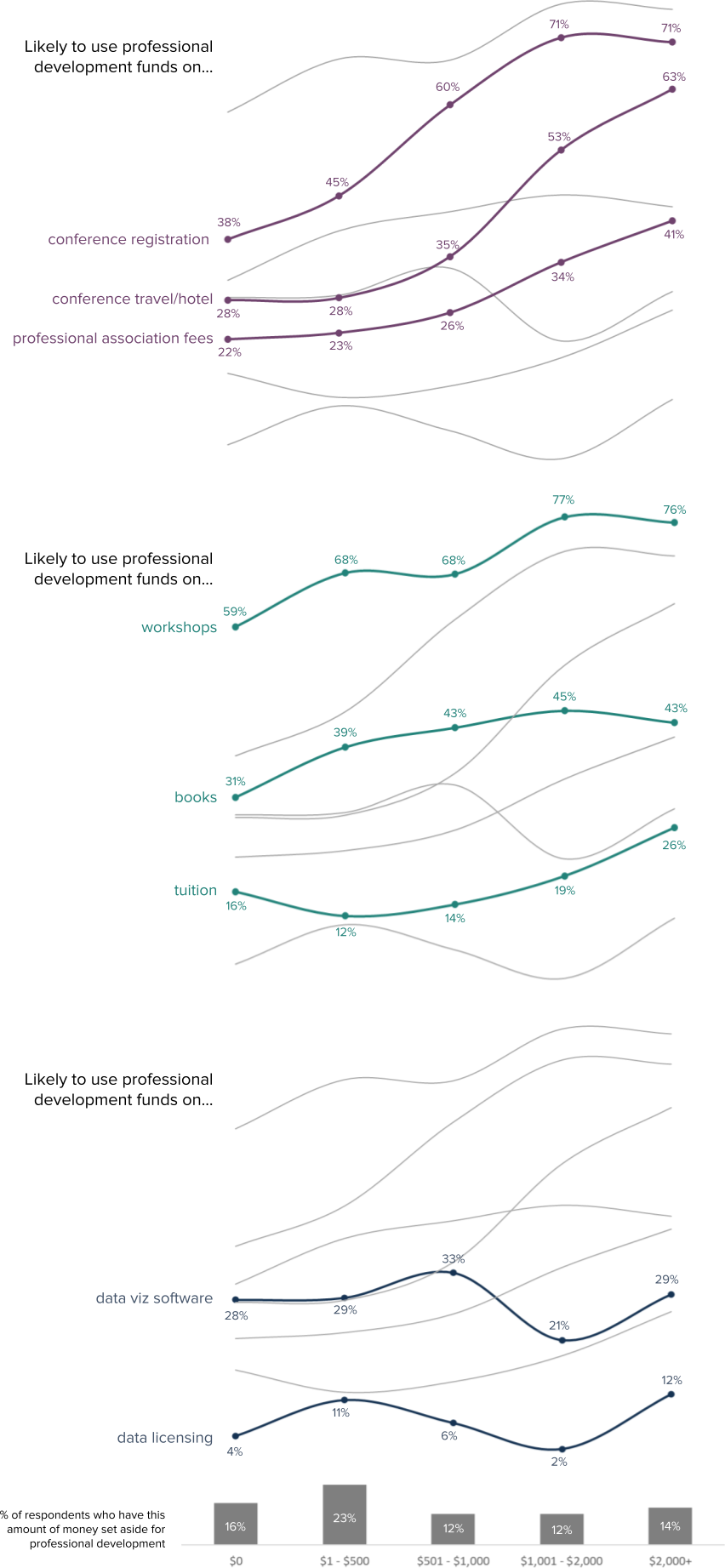
Skill building and development can be facilitated through professional development opportunities and funding. Six in 10 survey respondents (61%) indicated they had access to at least $1 in professional development funds and another 16% have $0 but still have professional development plans.
The type of activity survey respondents are interested in is largely dependent on how much they have to spend. Not surprisingly, those with more to spend are more likely to choose to budget for conference registration and travel/hotel (71% of those with more than $1,000 allocated say they will use it in this way compared to only 45% of those with less than $500).
Spending on books and tuition varies slightly with allocated funds but is relatively consistent regardless of budget. Data viz software and data licensing are lower funding priorities for everyone.
Figure 21 shows the different events, activities, or other costs they would likely cover using professional development funds depending on how much they anticipate being allocated in 2023; respondents could select all activities or resources for which they would consider using funds.
Figure 21. Plans for Professional Development Funds Depending on Budget (percents)
How do we get better?
Data visualizers seem to be consistently looking to learn and grow, and we have lots of different ways we do so. Similar to 2021, our top priorities for improving skills revolve around learning more about tools and design. Most of us like to learn by working through a project, but also make use of many other ways of gaining new information (e.g., video tutorials, workshops, and collaborations). Many are interested in attending data viz training, mostly through virtual platforms in both synchronous and asynchronous formats. We also have varying priorities for professional development funds and some of this depends on the amount we expect to receive.
What do the data tell us about the future of the industry?
Each year we try to think about what the future holds for data visualizers. Some years that means looking at trends in how long we’ve been doing this work, this year, like so many other communities, we’re looking at our jobs and how people might have moved into new roles. In the past year, most of us were relatively happy with our job situation - 69% of us did not move to a new position. This number, while it implies a certain stability in our industry, hides a curiosity about other opportunities. 42% of us who stayed put were actually looking for something else at the same time. Combined with the 31% who actually moved onto a new job in 2022, this means that 6 in 10 of us were restless and interested in what else might be out there.
Since the DVS began asking these questions in 2020, the percentage of people changing jobs and/or looking around for new opportunities has been relatively consistent (60%). Whether this is a result of the COVID-19 pandemic and the subsequent shakeup in the way we work and where we work is unknown. But what we can see is that mobility and curiosity about other opportunities have been staples for respondents for the past few years.
Figure 22 also shows that of those of us who moved onto a new job in 2022, over one quarter still haven’t yet found their forever home and continue to seek out new opportunities. Figure 22. Data Visualizers’ Job Mobility and Interest in New Opportunities (counts)

As any member of our community will tell you, the practice of data visualization is more than translating numbers to graphs and charts. When asked what they believed were the one to three most important issues facing data visualization [Figure 23], respondents indicated the lack of data visualization literacy, the lack of awareness of the impact of data visualization, and data visualization not having a seat at the table as key issues, the same issues identified by the 2021 survey respondents.
To provide additional richness to the responses, respondents were asked to rate the urgency of addressing the topics they identified, with responses of “extremely urgent” represented by the darker portions of the bars in Figure 23. Six of the important issues were rated as extremely urgent by those who included them as one of their top three important issues. In order of highest proportion reporting most urgent, these were: diversity in tech, other (e.g., clear purpose of data visualization, jobs, assessment of visualization quality and effectiveness), algorithmic bias, designing for disabilities, lack of ethical standards for visualizing data, and income inequality.
Figure 23. Top Issues Facing Data Visualization and Ratings of Urgency (counts)

Half (49%) of the survey respondents indicated there was something about the data visualization work they do that people they work with don’t understand, and at a high level, many of these concerns reflect the top issues to address. Though we haven’t yet thoroughly analyzed these data, respondents mentioned data literacy, people they work with not understanding the value of data visualization, and leadership not wanting to invest in training or tools as some of the aspects people don’t understand. Of course, upon initial review, the most noted items were the time and effort it takes to do quality data viz, as exemplified by quotes like this one:
What people just don’t get is…
The amount of time it takes to work with data on the front end in order to understand/clean/aggregate it properly in order to get to the stage of iterating valuable visualizations, as well as the time it takes to then format the visualizations in a proper/creative way that works best for the audience.
What do the data tell us about the future of the industry?
Survey respondents shared how they changed jobs over the last year. Over one quarter of those who changed jobs continue to seek out new opportunities, potentially signaling additional shifts as people find their data visualization homes and the job market settles. Respondents also recognized there are broad issues impacting the data visualization community. Our top three issues, the same as in 2021, were lack of data visualization literacy, the lack of awareness of the impact of data visualization, and data visualization not being involved in early conversations about data collection, structure, analysis, and reporting. We also identified and put words to the struggles with what others just don’t get about the data visualization work we do, namely that quality work takes time, skills, thoughtful planning, and iteration.
Suggestions for Further Exploration
Though we were able to get through a lot of the data in this report, it’s certainly not all of it. We invite you, the survey respondents, the members of the data visualization community, and those adjacent to and supporting data visualization to take a look at our complete dataset and answer some of your own questions. As we were exploring this year’s survey and writing up the findings we jotted down a quick list to get you started.
There are so many interesting ways to segment the data, and often enough respondents across categories to do significance testing. How do our types of data visualization tasks differ by our role, sector, or industry? What about our job movement in the last year? Or preference for remote work? Better understanding different segments of our community can help you see where you fit in or provide a new perspective on what it’s like to work in a given domain.
Since we are a part of a global community, looking at the regional data may highlight some interesting insights. Of course, not everyone in a country, city, or even neighborhood is exactly alike, so try to hold back any broad generalizations. But wouldn’t it be fascinating to know how our learning preferences differ around the world? Or if people in different regions have tool preferences that are based on more than availability? What are our perspectives on the most important issues facing data visualization worldwide?
If you find something in the report that you want to know more about, check out the dataset to see if there are different ways to parse the data. For example, years of professional and data visualization experience has more granular categories than presented here. You could choose to classify income in broader categories, or combine different types of respondents (e.g., freelancers, hobbyists) in various ways to see how they are similar or different.
There is richness in answers to the free-response questions that has yet to be explored. This is a great opportunity for our qualitative researchers, pulling out commonalities and themes on what people just don’t get about data visualization or the “other” tools and chart types we use that didn’t make it onto the list.
One opportunity to explore the survey data is to participate in the DVS State of the Industry Challenge. Each year we release a public version of the data and announce a challenge for members of the community to dive into our data and visualize something interesting in the data. What will you find?
Acknowledgements
The DVS SOTI survey is created, managed, analyzed, and published with support from the DVS Survey Committee including Jill A. Brown, Josephine K. Dru, Lisa Valade-DeMelo, Sheila B. Robinson, and Amy Cesal, Alexander Furnas, and Carrie Harrison. Josephine completed the data cleaning and preparation; Lisa, Jill, and Josephine contributed to the report visualizations and narrative.