

Executive Summary
The Data Visualization Society (DVS) disseminated its annual State of the Industry (SOTI) survey between 01 September and 01 October 2021. The goal of this survey is to understand the state of data visualization, the people who make it, the challenges they face, and where the field is headed. A total of 2,165 visualizers shared their perspective with us.
This DVS 2021 SOTI Survey Report is not a comprehensive review of the results; many details are left to the talented members of the DVS to explore in this year’s Survey Visualization Challenge. Below we provide high-level summaries of findings, analyze sensitive variables unavailable to the public, and answer important questions about the future of data visualization.
Who are we?
Respondents to the 2021 SOTI survey include DVS members (47.8%) and non-members (52.2%; “no” or “don’t know” responses), representatives from over 50 different industries, and visualizers from all six populated continents
Among the 1,484 respondents who identified their city or town, the top ten cities globally were New York City, London, Washington DC, Chicago, Seattle, Philadelphia, Denver, San Francisco, Toronto, and Boston.
Figure 1. Maps of Survey Respondents (counts)


Other cities with substantial representation (at least 9 respondents each) include Bengaluru and Singapore in Asia; Melbourne and Sydney in Australia; Montreal and Vancouver in Canada; Berlin, Paris, Barcelona, and Milan in Europe; and Portland (Oregon), Los Angeles, Atlanta, and Austin (Texas) in the United States. The most frequently represented cities in South America were São Paulo, Bogota, and Santiago, and Johannesburg in Africa.
Figure 2. Rank of Countries by Total Respondents Over Time (rank of counts)

Aside from the United States, the United Kingdom, and Canada, who have held the top three spots each year, respondent representation by country [Figure 2] has shifted over time. India has increased participation while other countries such as Australia and Spain have had more variable participation ranks over time. In 2021, India, Australia, Germany, France, Spain, Brazil, and the Netherlands round out the top ten, in order.
Figure 3. Non-English Languages of Data Visualizers (counts)

Data visualizers are also diverse in the languages they speak, with over 70 distinct languages apart from English [Figure 3]. Bubble size and color indicates the number of visualizers who identified speaking a language, ranging from many who spoke Spanish, French, German, Portuguese, Hindi, Italian, Dutch, Russian, or Chinese to a few speakers each for languages such as Vietnamese, Punjabi, Bulgarian, Malay, Farsi, Urdu, and Czech.
Survey respondents represent many different backgrounds, experiences, and perspectives. Of the 1,739 respondents who answered the question about gender, 43.1% identified as female, 55.9% identified as male, and 1.0% preferred to self-describe. The survey also collected information on whether respondents identified as LGBTQ+ and if they considered themselves a part of a historically disadvantaged or underrepresented racial or ethnic group. Of the 1,769 participants who responded to one or both questions, 25.4% identified as part of one or both groups [Figure 4].
Figure 4. Respondents Identifying as LGBTQ+ or from a Historically Disadvantaged or Underrepresented Racial or Ethnic Group (percent of respondents)


Among the 130 respondents who self-described their underrepresented group, 81 mentioned groups in the United States and 48 identified as part of groups around the globe. Some indicated they are Indigenous or Native to their respective regions, others noted religious or cultural affiliations, and a few respondents provided examples of contexts or situations in which they feel underrepresented. Shape, size, action, or wheelchair status of icons are not meant to reflect survey respondents but included to demonstrate variety in data visualizers.
Who are we?
DVS 2021 SOTI survey respondents represent 82 countries, 48 languages, and countless cultures from across the globe. We are females, males, and individuals who prefer to self-describe. One in four of us identify as part of the LGBTQ+ community or from a historically disadvantaged or underrepresented racial or ethnic group.
What roles do we occupy, how much do we make, and how do we spend our time?
Respondents who identified as freelancers or as working within an organization were asked to identify the role that most closely aligned with their job. Those who work in organizations also indicated which sector(s) they work in. Figure 5 shows the intersections of these roles and industries with box size corresponding to the number of respondents at a given intersection (industries with low numbers of visualizers across roles are not included in the visualization). Many data visualizers consider themselves analysts, a role which traverses every sector. Leaders from each sector were also represented in the survey, and for nearly all sectors they were the second most represented role behind analysts.
Figure 5. Data Visualizer Roles by Sector and Industry (counts)

The job titles that correspond to each role are as varied as the individual visualizers themselves. Respondents are data scientists, analysts, academics, and researchers; graphic designers, data storytellers, journalists, reporters, cartographers, architects, biologists, engineers specializing in machine learning, business intelligence, and software, and developers with experience on the frontend, with software, and for data visualization. We also heard from leaders at all levels, including team leads, managers, those of senior status, vice presidents, directors, chiefs, and founders. Notably, 25% of respondents held a job whose title contained “analyst,” “analytics,” or “analysis,” 10% reported a job title with some form of “visual” in the name (e.g., visualizer, visualization), and 1% had a title including the term “insight” all slight increases from the 2020 titles. There are also more roles like “Chief Visualization Officer,” “Creative Director,” and “Visual Communications/Design Specialist.” This variety in titles demonstrates the breadth of our global data visualization community and the increase in visualization-specific roles indicates increasing value in visualization skill sets.
Compensation of data visualizers provides another piece of the puzzle and is an important consideration regardless of whether respondents execute data visualization in their professional role or work in an adjacent field. The median annual salary for all respondents was USD $80,000–99,999; this did not differ by gender, LGTBQ+ status, or identifying as part of a historically underrepresented racial or ethnic group. The streamgraphs in Figure 6 show the relative breakdowns of the 1,539 participants who answered each question.
Figure 6. Annual Compensation by Gender, LGBTQ+ Status, and Historically Disadvantaged or Underrepresented Racial or Ethnic Group (proportion of respondents)

Some respondents did not report annual salaries but instead reported their hourly rates. These 754 visualizers who reported hourly pay earned a median USD $60–74, with most visualizers reporting less than US $150 hourly. Median pay for visualizers identifying as female, LGBTQ+, or part of a historically underrepresented group was USD $45–59, lower than visualizers identifying as male, not LGBTQ+, or not historically underrepresented. The streamgraphs in Figure 7 show the relative breakdowns by gender, LGTBQ+ status, and identification as part of a historically underrepresented racial or ethnic group.
Figure 7. Hourly Compensation by Gender, LGBTQ+ Status, and Historically Disadvantaged or Underrepresented Racial or Ethnic Group (proportion of respondents)

Nearly all survey participants indicated they spend some of their time producing visualizations [Figure 8]. Of those respondents, most reported spending up to 10 hours producing visualizations during their most recent work week. Respondents who reported spending 11 to 20 hours or 21 to 30 hours on a particular task were most likely to spend it on producing visualizations.
There are a series of other tasks leading up to visualization including data preparation, data analysis, and ideation that respondents are spending nearly as much time on as producing the visualizations themselves. For those who spent 11 to 20 hours or 21 to 30 hours on a task, data preparation was the second most selected task, suggesting visualizers are spending lots of time preparing data for visualization. Relatively fewer respondents engaged in ideation tasks, and of those who did, most spent 5 hours or less during their most recent work week.
Figure 8. Hours Spent on Data and Visualization Tasks (counts)

Many respondents also spent time engaging in other visualization tasks like meetings with coworkers or clients, supervision and management, or teaching and learning. Though most individuals who responded to this question reported spending 5 hours or less on these tasks, this was the area most selected by individuals who reported spending more than 30 hours on a task.
What roles do we occupy and how do we spend our time?
DVS 2021 SOTI survey respondents are analysts, leaders, designers, developers, academics, and journalists. We work in the public sector, for non-profits, in academia, and as freelancers and consultants. We earn a median annual pay of USD $80,000–99,999 or an hourly rate of USD $60–74, though visualizers identifying as female, LGBTQ+, or part of a historically underrepresented group reported lower hourly rates (USD $45–59). We are moving into increasingly more roles with hands-on visualization work. Most of us spend at least some time during our week producing visualizations, usually ten hours or less, and also spend a lot of time preparing and analyzing the data. Our variety in job titles demonstrates the breadth of our global data visualization community and the increase in visualization-specific roles in comparison to 2020 data suggests increasing value in visualization skill sets.
How do we visualize and what challenges do we have?
Many of the questions about how we visualize, including what types of tools respondents use and what chart types dominate their work, can be answered with the public dataset through the State of the Data Visualization Industry 2021 Challenge. Here we focus on painting a broad picture of the kinds of technologies one might expect data visualizers to use [Figure 9] and challenges encountered when non-preferred tools are selected for them [Figure 10].
Figure 9. Most Popular Technologies by Year (percent of respondents)

Of note, 2021 was the first year we asked visualizers what technologies they use often, and responses may be slightly impacted by this change of phrasing. The top tools are consistently Excel, Tableau, R, D3.js, Python, and ggplot/ggplot2, with PowerPoint making a recent emergence this year (2021 was the first survey that listed it as a response option, based on 2020 write-ins for “Other”). One area for further exploration is assessing whether the popularity of certain technologies coincides with trends among chart types (e.g., Tableau and PowerBI for dashboards, PowerPoint and Canva for infographics).
Respondents who identified as freelancers or employees within an organization were asked if they are able to choose their own tools or if their tools are chosen by others and what level of problems that causes [Figure 10]. For those who reported We have a set list of tools we’re expected to use for data visualization, those who chose and it causes some problems or and it causes major problems were asked to describe those problems. For both freelancers and employees, the primary challenges were that the chosen tools were inadequate in some way. Respondents indicated not being able to customize the visualizations in the way they wanted, the tool limited their creativity, or the tool was not the best choice for the visualizations they were developing.
Figure 10. Problems Encountered when Tools are Chosen by Others (counts and percents)

Respondents also indicated their top frustrations with doing data visualization [Figure 11] (n = 1,800). The most common frustration was lack of time, selected by 39.4% of visualizers who responded to this question. Lack of time remained the top frustration regardless of whether the visualizer was an employee at an organization, a freelancer, an academic, relatively new to data visualization, or a seasoned visualizer. Accessing data (26.9%), lack of design expertise (25.4%), and spending too much time on non-viz activity (25.2%) were the next most commonly selected responses. Overall, visualizers were least frustrated with the volume of data (9.2%), lack of collaboration (15.2%), or information overload (17.8%). Across employment categories, more seasoned visualizers selected lack of time as their primary frustration and indicated fewer frustrations in other categories. New visualizers, more frequently selected other frustrations, often in addition to “time." For example, ten of the thirteen programmed response options were selected by more than 20% of new visualizers whereas only six of the responses reached this threshold for seasoned visualizers.
Figure 11. Top Frustrations with Doing Data Visualization (count)

Notably, seasoned freelancers indicated their second frustration was not enough respect for data viz (26.8%) while new visualizers across employment categories were frustrated by lack of technical skill (25.7–34.6%). Of the 148 respondents who selected “other” and filled in a response, most described the challenge of communicating the importance of quality data visualization to team members, leaders, and clients. Other responses included frustrations with unfamiliar or low quality datasets and the amount of effort that goes into cleaning and preparing the data for visualization.
How do we visualize and what challenges do we have?
DVS 2021 SOTI survey respondents use a myriad of different tools to accomplish their data visualization tasks. Across the past 5 years, Excel, Tableau, R, D3.js, Python, and ggplot/ggplot2 have been some of the most popular tools, though respondents report dozens of unique tools annually. We do find it challenging when tools are chosen for us as some are inflexible toward our creative visions or not a good fit for the type of data or visualization task. Overall frustrations with doing data visualization can be summarized succinctly: we need more time. Even seasoned visualizers indicated this as their primary frustration.
How has the COVID-19 pandemic impacted data visualizers?
Though not typically one of the primary questions we seek to answer, the DVS can’t ignore the potential impacts of a global pandemic on data visualizers around the globe. One-third (n = 606) of survey respondents who answered a question about employment (n = 1,804) indicated they changed their employment status over the past year, and one-third of those individuals (n = 217) noted that the COVID pandemic and related economic crisis was a factor in their change. By comparison, only one-quarter of 2020 respondents (n = 348 of 1,284) indicated they changed their employment status, and one-quarter of those individuals (n = 86) indicated the change was a result of the pandemic.
The pandemic most impacted freelancers, with 46.0% indicating their change in employment status was related to the pandemic. Comparatively, 30.9% of individuals employed at organizations and 32.7% of academics/teachers reported their employment change was associated with the pandemic.
Figure 12. COVID Impacts on Work and Benefits (counts)

Nearly one in six respondents (n = 354) indicated their compensation and/or benefits were negatively affected by the COVID pandemic in some way. Of the individuals who selected one of the response options:
134 had an expected pay raise deferred
117 took a temporary pay cut
93 had their benefits reduced
61 respondents had their position cut
27 took a permanent pay cut
The overlapping regions in Figure 12 are relative representations of where individuals experienced more than one impact to their compensation and/or benefits.
Respondents across job types described other impacts to their positions or work/life balance due to COVID (n = 104). Many reported their typical clients or freelance work was harder to find, others indicated their workload increased for the same or less pay due to others leaving their positions, and some indicated they had to change their work because of child or eldercare requirements. Approximately half of these respondents used the space to describe or elaborate on circumstances in the predetermined response options.
The streamgraphs in Figure 13 and Figure 14 show the compensation for individuals who experienced negative impacts due to the COVID-19 pandemic.
Figure 13. Annual Compensation for Individuals who Experienced Negative Impacts to Pay Due to the COVID-19 Pandemic (proportion of respondents)

Those who experienced permanent pay cuts tended to be in lower income categories and around the survey median income for both individuals who reported annual compensation and those who reported hourly compensation; those with hourly compensation were proportionally more impacted in these lowest pay categories.
Temporary pay cuts seemed to impact respondents across income categories and compensation types, with slightly higher proportions of those with low hourly rates impacted. Deferred pay raises were most felt by individuals around the median annual salary and by respondents with low hourly rates.
Figure 14. Hourly Compensation for Individuals who Experienced Negative Impacts to Pay Due to the COVID-19 Pandemic (proportion of respondents)

A minority of individuals did indicate positive effects of the pandemic, including changing to better paying positions or experiencing boosts in freelance work, though this was not the norm.
How has the COVID-19 pandemic impacted data visualizers?
Like others globally, DVS 2021 SOTI survey respondents report changing jobs in the last year, often attributing the shift to changing circumstances related to the COVID-19 pandemic. We were also affected by reductions in our pay, benefits, and even our positions.
What do the data tell us about the future of the industry?
The future of any industry is driven by the roles and job status of its membership. As previously noted, changes in employment status for data visualizers increased from 2020, with 33.6% of 2021 respondents reporting a change in status. Of those who identified as LGBTQ+, 34.8% indicated they changed jobs in 2021, while 39.2% of those who identified as part of a historically disadvantaged or underrepresented group reported a change in employment status in 2021. Freelancers reported higher degrees of job changes (43.0%) while academics had relatively low job changes (25.6%); employees in an organization were similar to the overall sample with 33.5% changing jobs.
Figure 15. Years of Data Visualization Experience over Time (percents by year)

One way to predict the future is to understand the past and present. One item we’ve asked across each year of the survey is how many years of data visualization experience they have. The ridgeline plot in Figure 15 shows the increases over time in the proportion of seasoned data visualizers, as well as peaks in newer visualizers gaining experience.
Data visualizers who are relatively new to the industry may face certain challenges when seeking to integrate data visualization into their work more formally. Respondents with five years or fewer of data visualization experience were asked what current or recent barriers they have faced in getting into data visualization professionally; 462 individuals answered this question. There were four primary themes that emerged in these data and a set of minor themes.
First, respondents expressed “Not having enough time to dedicate to getting a more in depth understanding of the tools I use.” Time also emerged in terms of finding balance between other responsibilities, both during work hours and on personal time.
The time theme also intersected with the second theme; many respondents indicated a major barrier to entry in data visualization is the lack of support to do quality work. This gap was noted from individuals who were not receiving needed support from their supervisor or organization, with “leadership not seeing it as valuable enough to devote time or resources to it.” Others indicated they needed additional support from mentors or peer networks, some more optimistic, “Building a network of similar minds and clients (which is totally doable but takes time)” and others overwhelmed, “Finding mentors and knowing where to start for training.”
The need for skills and training emerged as another theme, with participants indicating they “can't find a structured program to follow.” A lack of skills was mentioned for design, analysis, coding, statistics, math, UX/UI, and web programming to name a few. A less common barrier that emerged was being self-taught, with one respondent indicating their barrier was “My technical expertise…I am self-taught and would benefit from a stronger foundational knowledge base.”
The other major barrier to entry was having a steady workflow or adequate compensation. In addition to finding data visualization-specific jobs or challenges with the market for data visualization in a particular region, some participants “Don't know how to earn money through dataviz alone.” Respondents also noted that many of the data visualization-specific jobs available were not entry-level, thus presenting a challenge in building a portfolio and gaining the requisite experience to earn adequate compensation. One participant summarized their barriers to getting into data visualization in these areas very clearly, “Short term financial needs; lack of professional experience; lack of time to work for free.”
Data visualizers in general, not just newer practitioners, are continually looking to learn new skills. When asked what new skills they planned to prioritize, respondents were evenly split between prioritizing design skills (26.8%), improving skills with an existing tool (24.3%), or learning a new tool (25.9%). The few individuals (5.0%) who selected “other” reported wanting to learn how to develop infrastructure, improve their storytelling, or teach others. Responses were similar across new and seasoned visualizers, with seasoned respondents placing less priority on improving skills with existing tools and more priority on learning new tools. Otherwise priorities did not differ by employment type, LGTBQ+ status, or historically underrepresented groups.
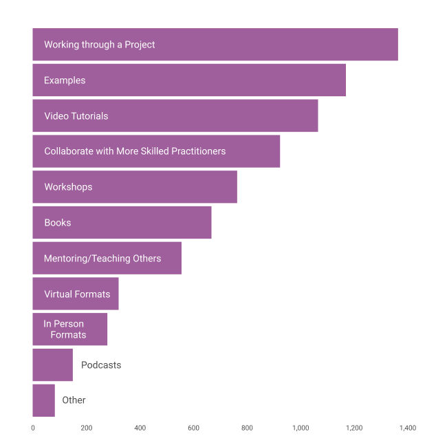
To learn these new skills, respondents reported finding it useful to work through a project (76.2%), engage with examples (65.3%), and watch video tutorials (59.5%), see Figure 16. They find podcasts the least helpful (8.4%), followed by in-person formats (15.6%), though this might be an artifact of the current work environments. Many of those who reported “other” gave examples of blogs, forums, or other communities they go to for instructions, guides, or to ask their own questions.
Figure 16. Useful Methods for Learning New Visualization Techniques (counts)
Skill building and development can be facilitated through professional development opportunities and funding. Over half of the survey respondents (58.0%) indicated they had access to professional development funds.
Figure 17. Likely Use of Professional Development Funds (percent of respondents)

Employees in an organization (65.4%) and academics (67.6%) tend to have more access to funds while freelancers do not (35.5%). Seasoned visualizers tend to more frequently report having professional development funds (62.5%) than new visualizers (54.4%). Two-thirds (66.8%) of respondents who identified as LGBTQ+ indicated they had access to professional development funds, a higher proportion than those who did not identify as LGBTQ+. Those who identified as historically underrepresented did not differ from the overall access to professional development funds (58.0%). Figure 17 shows the different events, activities, or other costs that could be covered by professional development funds; respondents could select all activities or resources they would consider using funds for.
What do the data tell us about the future of the industry?
As DVS grows and matures, so do the data visualizers. Since the first survey in 2017, we have become increasingly seasoned as data visualizers, but also maintain a contingent of individuals new to data visualization practice. Our new visualizers reported barriers to entering data visualization including not having enough time to learn about or create data visualizations and not having adequate support from mentors, leaders, or their organization. We all are looking to learn new skills and tools and prefer to work through a project, example, or video tutorial to do so. The future of the data visualization industry appears optimistic with so many of us willing to learn and grow regardless of how much experience we have. However, our efforts may be hampered if we are not able to find the time, support, or training to develop the skills we need or build quality visualizations for ourselves and our clients.
What else should we know about the state of the data visualization industry?
Data visualizers are more than people who turn numbers into informative and beautiful figures; we also consider the importance of issues intersecting with our practice.
Figure 18. Top-Rated Important Issues Facing Data Visualization (counts)

When asked what they believed were the one to three most important issues facing data visualization [Figure 18], respondents indicated the lack of data visualization literacy, the lack of awareness of the impact of data visualization, and data visualization not having a seat at the table as key issues. These top three issues were the same for both new and seasoned data visualizers.
Individuals who identified as being part of a historically underrepresented or disadvantaged racial or ethnic group also indicated lack of data visualization literacy and awareness of its impact as their top two issues, and included diversity in tech as their third most important issue (up from sixth in the overall analysis).
Speaking to the gaps in data visualization literacy and awareness of impact, nearly half of the survey respondents indicated there was something about the data visualization work they do that people they work with don’t understand. The primary theme, identified by nearly one in three respondents, was that others don’t realize how much time and effort it costs to visualize data well. Numerous respondents expressed this in few words: “Quality takes time.” Others elaborated on their process, indicating “They don't understand that I don't just "pull the report"... it's data from like 20 different locations, that needs to be standardized, formatted, cleaned, then presented.”
Another primary concern of approximately one in five respondents is the lack of data savvy. Understandably, this category overlaps with the time investment of data visualization, but also encompasses understanding and processing sometimes unfamiliar data. People don’t always know “That understanding the underlying data on which the viz is built can be complex and [it’s] not easy to accurately portray in a software platform.” Others included comments about the value of data processing and analysis, indicating “how statistical properties of data (should) inform visualisation choices is not always appreciated.”
A substantial challenge respondents face is explaining that data visualization design is a key part of the process. “They think it's just about being ‘pretty’ and don't understand that every element has a purpose and was carefully thought through.” In addition, there seems to be limited understanding that for visualizations to be effective, they need to be tailored for the audience and the situation. “Understanding the users' context and their goals/needs before just choosing a visualization method.”
At the intersection of design and value were quotes such as: “Carefully crafted visuals can greatly reduce the time to insight. Design plays a huge part in whether or not the end user can make sense of data.” emphasizing the multifaceted uses of data visualization. Respondents noted that others don’t always see value in the capacity for data visualization to communicate important information clearly and gain insights for decision-making and problem solving.
Finally, respondents identified challenges with change management, their colleagues’ and leaders’ “reluctance to try new methods of visualizing data.” They mentioned allegiance to certain software and visualization types, including bar charts, pie charts, line graphs, and tables.
What else should we know about the state of the data visualization industry?
DVS 2021 SOTI survey respondents recognize there are broad issues impacting the data visualization community. Our top three issues were lack of data visualization literacy, the lack of awareness of the impact of data visualization, and data visualization not being involved in early conversations about data collection, structure, analysis, and reporting. We also identified and put words to the struggles with what others just don’t get about the data visualization work we do, trying to find new ways to tell leaders that quality data visualization takes time. Dashboards and tables are not always the answer, and complex data take careful consideration in how they should be presented. This time spent understanding the data and considering design elements can be critical for presenting clear information to the end user and, ideally, providing them with data they can readily use to drive decision-making. Data visualizers want to meet the needs of clients, create impactful visualizations, and change the world but often feel stymied, potentially presenting challenges for growth of the industry.
Methods
A total of 66 questions were designed to elicit responses across topics including demographics, roles and tasks, experience and compensation, tools and charts, challenges and changes, COVID-19 impacts, looking toward the future, and role-specific questions for freelancers/consultants/independent contractors, individuals who work in organizations, academics, students, and hobbyists. All questions were optional with the exception of the first asking about role, which allowed for the survey to direct participants to selected items related to identified role(s); individuals could still select “Prefer not to answer” for this required question to move forward with the remainder of the survey. Individuals who reported holding multiple roles were asked questions from each relevant section; the most questions asked to an individual participant with many roles was 60. On average, participants were asked 47 questions (mean = median), answered 43 questions (median; mean = 39) and completed the survey in 11 minutes (median).
Key Survey Items
A total of 2,165 respondents provided usable data for analysis in the survey and 1,788 reached the end of the survey. As described above, this report does not detail all responses to each item, but rather seeks to answer a few key questions about the state of the industry. Here we outline the survey items that will answer each question.
Who are we?
To provide context to our global network, visualizers answered a series of demographic questions, including DVS membership status. It should be noted that the membership structure of DVS changed in June 2021; individuals had to opt into membership and accordingly, distribution of members and non-members taking the survey has shifted this year. Visualizers also shared their location. We plotted the city and country locations on a map, with each location segmented into buckets to approximate how many visualizers are in a location; the buckets align with buckets created for the 2020 map images. We also have global representation in terms of languages and asked visualizers to share the languages they speak regularly.
Other demographic items were included to describe who visualizers are as people. We asked individuals to report their gender, including an option for “Prefer to self-describe.” Individuals were also provided the opportunity to identify as LGBTQ+ and if they consider themselves to be a member of a historically disadvantaged or underrepresented racial or ethnic group. Race or ethnicity were not asked in this survey as these characteristics vary widely across the globe and responses could present challenges with maintaining anonymity.
A small number of survey items were deemed sensitive and accessible only by the DVS board and survey organizing committee. These include fields with personally identifiable information (known as PII): locations more granular than country, language(s) spoken, job title, LGBTQ+ identification, and identification as a member of historically disadvantaged or underrepresented groups. Some of these items are shown in aggregate in this report; none were included in the full dataset released to the public for analysis and visualization.
What roles do we occupy, how much do we make, and how do we spend our time?
We answered the second question with responses about data visualizers’ occupations. Though many are not in roles specific to data visualization, many do work that incorporates some data visualization. To understand the spectrum of occupations, we asked for job titles; responses to this question were cleaned for summarization and are only shared with the public in a reduced dataset. Individuals who work in an organization or selected Freelance/Consultant/Independent contractor when asked to describe their role were also asked to identify the descriptor of the role closest to their job functions. These included analyst, scientist, engineer, developer, journalist, designer, cartographer, teacher, or leadership. Individuals within an organization were also asked to identify the industry (or industries) in which the organization operates.
We included a few questions about annual and hourly compensation, converted to United States Dollars (USD) for ease of comparison. Even though discussions of money can be considered impolite in some cultures, we felt it is important to share among peers or with those looking to make data visualization a more significant part of their livelihood to inform expectations and encourage everyone to appropriately value their own and others’ work.
The final part of this question is answered by individuals sharing how much time they devoted to data visualization activities in their most recent work week. The question was worded this way, rather than reporting about their average work week, as people provide more accurate estimates of recent events (e.g., Clarke, Fiebig, & Gerdtham, 2008). Even if some individuals had atypical work weeks, across respondents, work weeks are likely atypical in different directions (e.g., some people spent less time on their typical tasks, others spent more time on their typical tasks) and the aggregate responses are still informative.
How do we visualize and what challenges do we have?
A series of items in the survey focused on tools and technologies, popular visualization types, and challenges and frustrations experienced when they visualize data. Visualizers indicated what technologies they use often to visualize data. The response options ranged from platforms for mapping to data analysis to graphic design, from coding-heavy to point-and-click, and from dashboard to pen-and-paper drawing. Freelancers and those with a role in an organization also shared what problems they encounter when their tools are chosen by others. Response options were informed by previous surveys and also had space for visualizers to report new challenges.
As another way to understand how individuals are visualizing, they shared examples of how they communicate their data visualizations (e.g., dashboard, presentations, apps, physical media). Individuals also shared a broader perspective on their top three biggest frustrations when it comes to data visualization. Similar to the problems question described above, response options as well as a space to specify other frustrations were provided.
How has the COVID-19 pandemic impacted data visualizers?
Rounding out a second year of a global pandemic, we added two questions about how visualizers might have been impacted. First, individuals were asked if they changed employment or employment status in the last year and following that question were asked if the COVID pandemic and related economic crisis was a factor in their employment status. It was asked this way as people may have changed employment based on factors related to the pandemic or they may have retained their current status and decided not to make a change due to the pandemic context. Second, individuals shared if the pandemic has negatively affected their compensation or benefits.
What do the data tell us about the future of the industry?
Many questions can inform both the current and future state of the data visualization industry. We can show how many visualizers have changed employment or are looking for new opportunities. Distributions of years of data visualization experience across all five years of survey data provide an opportunity to look into the past to inform our future. Visualizers who have 5 years of experience or less were also asked what barriers they have faced in getting into data visualization professionally. Looking forward, visualizers of all experience levels shared their next priority for learning and preferred learning methods for new data visualization skills. Individuals also shared what they would be likely to use professional development funds on, providing information on what resources are highly valued.
What else should we know about the state of the data visualization industry?
Finally, to round out the findings, individuals identified their one to three most important issues they believe are facing data visualization. Response options were informed by previous survey items as well as popular topics among data visualization practitioners. Visualizers were also provided the opportunity to describe what others just don’t get about their visualization work. Themes emerged from the data (inductive) and were coded.
Survey Distribution and Sampling
The 2021 SOTI survey was disseminated online between 01 September and 01 October 2021. Distribution mechanisms included an email announcement and series of reminders from the official DVS email address, an announcement in Nightingale (the DVS publication), a post on the American Evaluation Association blog (AEA365), a series of posts on the DVS Slack, and numerous social media posts (e.g., Twitter, LinkedIn) from DVS and others (e.g., Meetup Groups).
Analysis Plan
Survey data were cleaned prior to analysis. Cleaning included standardizing open responses for monetary units, cities, and spoken languages, standardizing response options to align with surveys across years, and removing personally identifiable information (e.g., websites, unique roles) from open response entries. The design of the survey prioritized multiple choice (predefined) responses wherever possible, so fewer questions required cleaning than in past years. This tradeoff aimed for better per-question response rates (i.e., higher n) and less messy data, but at the expense of less granular data (e.g., no continuous numeric responses resulted in the inability to calculate means for many variables).
A total of 2,182 responses were submitted; 17 of these were removed from the final count because they only answered the first question and provided no other usable data. Survey responses from all five years were checked for accidental duplicates within the same year; however, because the data were anonymous, there was no way to check for double submissions from the same individuals if they selected different answers in the same year’s survey.
Survey results are primarily presented descriptively, focusing on group sizes (ns) and percentages. Because the survey was programmed with different branches and other mechanisms to reduce the number of items for each respondent, denominators for each question also vary. These are included in the narrative interpretation or in figures of relevant questions in the Findings section.
Basic qualitative analyses were conducted using both inductive and deductive approaches. Where qualitative responses were in an “Other, please specify” format, responses were first scanned to determine if they fit into any of the predefined response categories or anticipated response groupings (deductive). Responses that did not fit into these categories, like responses to purely free-input questions, were reviewed and categorized as themes emerged (inductive).
Suggestions for Further Exploration
Developing our understanding of data visualizers today should not stop here. This report offers only a start for learning from the 2021 Data Visualization Society’s SOTI survey results. From here, we call upon our fellow visualizers, both survey respondents and onlookers, to take this rich dataset and dissect, analyze, and showcase who we are and what we’re made of. We will leave you with a few parting ideas for further exploration of this and other data visualization data.
We found that most respondents want more time, but we don’t know how those who want more time might be different from those who did not indicate that time was a barrier or frustration. While many top barriers and frustrations are unsurprising, what is interesting is that there are substantial segments of respondents who did not find these top issues as problematic. How do they differ? Are they in certain sectors or do they come from a certain educational background? Do they make visualizations in certain ways or for certain people? The answers to these questions can give insight to the recommendations and resources we provide to those who are facing certain challenges.
We saw that roles and titles of respondents may be shifting to focus on visualization, but we don’t know how job titles intersect with specific roles, or if individuals with similar titles spend equivalent amounts of time on data visualization tasks. For example, what job titles do leaders have? How does the time spent on data visualization tasks differ between data visualization specialists, designers, consultants, engineers, and developers? Additional analyses and systematic parsing of the job titles field would help inform who we are and how we work in our respective domains, providing insight for individuals as they start on their data visualization journey or those seeking to understand data visualization work from positions of leadership or other visualization-adjacent roles.
We know that respondents have a range of data visualization and professional experience, but we don’t know how characteristics might differ between newer visualizers and more seasoned professionals. Do they use different tools or design different visualizations? Do they occupy similar roles, or do we see changes in role types as someone has spent longer in the industry? This type of evolution through experience and careers will be useful to track over time.
We explored many questions segmented by individuals who identified as doing freelance work, consulting, or work as an independent contractor as well as those who hold a position in an organization, but we don’t know a lot about hobbyists, students, academics, or those who earn a passive income from data visualization. Do they have specific barriers or challenges? Who do they make visualizations for? One report cannot do justice to all our unique roles within and contributions to data visualization, and it is important to learn what we can and share insights from these distinctive groups.
We showed how respondent countries, data visualization experience, and top tools changed over time, but we don’t know how other variables have evolved - or not. Does the popularity of chart types change over time? What about barriers and challenges? Do any of these changes differ by role or industry? Comparing this year’s SOTI survey data with prior years’ survey responses can provide a rich understanding of the patterns and ongoing or emerging needs of data visualizers.
At the beginning of the report we summarized other recent surveys of visualizers, but we don’t know how our respondents compare. The Observable and Viz for Social Good surveys had different purposes, but shared many similar demographic and descriptive questions with the DVS SOTI survey. Are each of these surveys telling the same story about who data visualizers are? If not, what are the differences and what other questions can we explore to understand these differences? Building synchrony across organizations to understand our overlapping interests and challenges could bring more resources to support data visualizers worldwide.
These data provide a mere snapshot of who we are as visualizers at this moment in history, though only time will tell how we evolve to merge our skills, our passion for learning, and our attention to the important issues facing data visualization today to shape and evolve the data visualization industry.
Acknowledgements
The DVS SOTI survey is created, managed, analyzed, and published with support from the DVS Survey Committee including Amy Cesal, Alexander Furnas, Josephine K. Dru, Lisa Valade-DeMelo, Sheila B. Robinson, and Jill A. Brown. Josephine Dru completed the initial data cleaning, Jill A. Brown was the primary author of this report, with significant input from Josephine K. Dru, Erica Gunn, and Lisa Valade-DeMelo.
References
Clarke, P. M., Fiebig, D. G., & Gerdtham, U. G. (2008). Optimal recall length in survey design. Journal of Health Economics, 27(5), 1275-1284. doi:10.1016/j.jhealeco.2008.05.012
Mauri, M., Elli, T., Caviglia, G., Uboldi, G., & Azzi, M. (2017). RAWGraphs: A Visualisation Platform to Create Open Outputs. In Proceedings of the 12th Biannual Conference on Italian SIGCHI Chapter (p. 28:1–28:5). New York, NY, USA: ACM. https://doi.org/10.1145/3125571.3125585
Wee People Font Copyright (c) 2018 ProPublica and Alberto Cairo.