

Executive Summary
The 2023 Data Visualization Society (DVS) disseminated its annual State of the Industry (SOTI) survey was disseminated online between 15 September and 15 October 2023. Distribution mechanisms included an email announcement and series of reminders from the official DVS email address, an announcement in Nightingale (the DVS publication), a series of posts on the DVS Slack, and numerous social media posts (e.g., X, LinkedIn) from DVS and others (e.g., Meetup Groups). A total of 869 visualizers shared their perspective with us.
As with previous versions, this DVS 2023 SOTI Survey Report is not a comprehensive review of the results; many details are left to the talented members of the DVS to explore in this year’s upcoming Survey Visualization Challenge. Below we provide high-level summaries of findings, analyze sensitive variables unavailable to the public, and answer important questions about the future of data visualization.
Who are we?
Respondents to the 2023 SOTI survey include DVS members (56.4%) and non-members (43.6%; “no” or “don’t know” responses) from 54 countries spanning all six populated continents [Figure 1]. Among the 777 respondents who identified their location, the top ten locales globally were Washington DC/Northern Virginia, New York City, London, Seattle, Los Angeles, San Francisco, Boston, Chicago, Raleigh, and Austin.
Figure 1. Maps of Survey Respondents (counts)

Melbourne held the top representation in Australia; Toronto had the most number of respondents in Canada; Paris, Berlin, and Milan tied for the next highest representation in Europe after London; São Paulo had the most respondents from South America; and Bengaluru had the highest concentration of respondents from Asia.
Across countries, most respondents were from the United States, the United Kingdom, and Canada, who have held the top three spots each year [Figure 2]. This year Germany, India, Australia, Brazil, Russia, and Spain, France, Switzerland, and Italy round out the top ten, in order.
Figure 2. Rank of Countries by Total Respondents (counts)

In addition to location, data visualizers are also diverse in the languages they speak. Over 1 in 3 respondents who answered this question identified languages besides English, and we collectively listed over 50 distinct languages [Figure 3]. Bubble size and color indicates the number of visualizers who identified speaking that language. The nine listed by the most respondents mostly match the past two years’ top listings: Spanish, German, and French, followed by Portuguese, Russian, Italian, Hindi, Chinese, and Swedish.
Figure 3. Non-English Languages Spoken by Data Visualizers (counts)
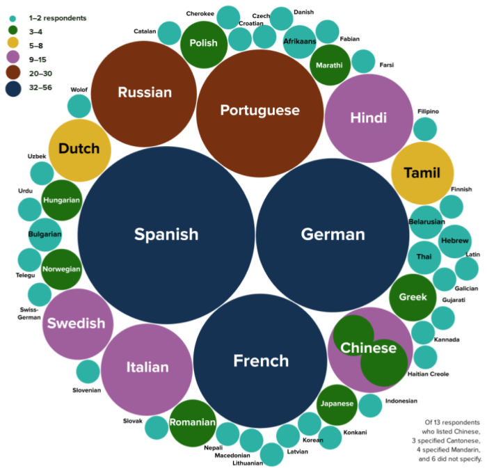
Interestingly, while 2023 respondents collectively listed fewer distinct languages, the proportion who identified as speaking non-English languages remains identical to 2022 and 2021: 37% of all data visualizers who answered this question and 28% of everyone who took the survey.
Survey respondents represent many different backgrounds, experiences, and perspectives. Of the 674 respondents who answered the question about gender, 53.6% identified as women, 42.6% identified as men, and 3.9% preferred to self-describe. The survey also collected information on whether respondents identified as LGBTQ+ and if they considered themselves a part of a historically disadvantaged or underrepresented racial or ethnic group; 27.0% identified as part of one or both groups [Figure 4].
Figure 4. Respondents Identifying as LGBTQ+ or from a Historically Disadvantaged or Underrepresented Racial or Ethnic Group (percent of respondents)

Among the 26 respondents who self-described their underrepresented group, most mentioned groups in the United States and a few identified as part of groups around the globe. Some indicated they are Indigenous or Native to their respective regions, others noted religious or cultural affiliations, and a few respondents provided examples of contexts or situations in which they feel underrepresented. Shape, size, action, or wheelchair status of icons are not meant to reflect survey respondents but included to demonstrate diversity in data visualizers.
Who are we?
DVS 2023 SOTI survey respondents reported living in 54 countries, speaking over 50 languages, and are a part of countless cultures from across the globe. We are men, women, and individuals who prefer to self-describe. One in four of us identify as part of the LGBTQIA+ community or from a historically disadvantaged or underrepresented racial or ethnic group.
What roles do we occupy and in what contexts do we work?
The 2023 survey received 869 responses to its opening question on data visualizer roles. Echoing the past three years’ surveys, this question listed six options: four paid capacities plus two unpaid. The answers from 2023 closely match the distribution from 2022. As Figure 5 shows, the two most frequently represented—Employee (“Position in an organization”) and Freelance (“/Consultant/Independent contractor”)—were chosen by roughly 3 out of 4 and 1 out of 5 data visualizers respectively.
Figure 5. Data Visualization in Mostly Paid Capacities (percents and counts)

Only 6% of respondents indicated that they do data visualization exclusively in unpaid capacities (as a Hobbyist and/or Student). This total is similar to the 7–8% of respondents who chose just Hobbyist or Student in the 2022, 2021, and 2020 DVS survey populations.
Respondents who chose Employee or Freelance were asked which of nine roles most closely aligns with their job and whether data visualization constitutes the primary focus of their work, an important secondary part, or neither. The overall share of respondents who identify data visualization as their primary focus has continued to increase slightly, from 30% in 2020 to 34% in 2021 and 35% in 2022 to 37% in 2023. Figure 6 shows substantial variation by role type and some variation by employment context. Designers and Developers have the highest overall chance of doing data visualization as their primary focus. Among Analysts (the largest group, with close to 250 respondents), about 1 in 4 do data visualization as their primary focus.
Figure 6. Primacy of Data Visualization by Role Type (percents)

The job titles that correspond to each role include data scientists, analysts, academics, and researchers; graphic designers, data storytellers, journalists, reporters, cartographers, architects, biologists, engineers specializing in machine learning, business intelligence, and software, and developers with experience on the frontend, with software, and for data visualization. We also heard from leaders at all levels, including team leads, managers, those of senior status, presidents, directors, chiefs, and founders. Notably, 33.2% of respondents indicated a job title containing the word “data,” 27.3% held a job whose title contained “analyst,” “analytics,” or “analysis,” and 15.3% reported a job title with some form of “visual” in the name (e.g., visualizer, visualization), all similar to previous years; titles. Just over 10% had titles related to “art” or “design,” another 10% were related to “developer” or “engineer,” and just over 7% indicated a role in “business intelligence” or other business related roles, slightly higher than previous years.
Respondents who chose Employee (“Position in an organization”) were also asked about the context (sectors and/or industries) of their organizations. In previous years these were reported together, but this year the team split sector and industry into two questions. Figure 7a shows how role types intersect with their identified organizational sector. Box size corresponds to the number of respondents at a given intersection. Analysts and folks in leadership roles are well represented across sectors. Figure 7b shows how role types intersect with industry. There is relatively even distribution across industry categories included in the survey, but notably many respondents identified their industry as “Other” suggesting a breadth of industries to explore further.
Figure 7. Data Visualizer Roles by Sector and Industry (counts)


Knowing that where and how we work has changed dramatically in the past few years, we wanted to better understand the situation data visualizers find themselves in and whether or not they are happy with their current work arrangement - be it on site, remote, or a mix of the two. Half (50%) of survey respondents who answered a question about employment told us they are currently working remotely; around one in 10 are on site (12%); and more than a third are working in a hybrid way (37%). While 73% told us that they like their current work arrangement (whatever it may be), 10% would prefer more opportunities to interact regularly with colleagues in-person, and 16% would prefer less. This has remained fairly consistent since we first asked in 2022.
Figure 8. Current and Preferred Work Arrangements (percents)

What roles do we occupy and in what contexts do we work?
DVS 2023 SOTI survey respondents work in the public sector, for non-profits, in academia, and as freelancers and consultants. Our job titles show how varied and broad our day-to-day work likely is and demonstrates that our community has visualizers across all levels of leadership. We are analysts in public, private, and non-profit spaces, in industries ranging from finance to marketing to IT. In the past few years we’ve changed where we work, and nearly three-quarters of us are happy with our current arrangement.
How do we spend our time and how much do we make?
One item we’ve asked across each year of the survey is how many years of data visualization experience we have. The ridgeline plot in Figure 9 shows the increases over time in the proportion of more seasoned data visualizers. The highest proportion of respondents to this year’s survey, as in each prior year, have between six and ten years of data visualization experience.
Figure 9. Years of Data Visualization Experience over Time (percents by year)

Across years it is interesting to see the continued presence of folks within their first few years of data visualization. This consistent input of data visualizers new to our community suggests that there is still interest in joining this relatively new field. We also notice more folks in the higher years of experience categories. Understanding the shifting distributions of data visualizers can help inform what types of resources might be helpful. A seasoned data visualizer may need different support than someone relatively new to the field.
Another feature of someone’s data visualization practice that might be helpful to understand is how much time they spend on different types of tasks. The small multiples in Figure 10 show some of these practices. Overall, most visualizers spend fewer than ten hours on any type of task in a given week. Considering the limited number of hours in a week, it makes sense that we don’t see too many people spending upwards of 20 hours on any type of task. Respondents reported spending the most time producing visualizations, it has the highest proportion of participants spending 11 hours or more in the prior week on the task. Two categories of tasks stick out as having the most “none” responses where people are spending no time: managing data visualization tasks and other visualization tasks. Understanding and documenting the scope of visualizers’ time is important to normalize how we are working and what it takes to produce quality visualizations.
Figure 10. Relative Hours Spent on Data and Visualization Tasks (counts)

Transparency around compensation can help professionals establish their rates and advocate for what their time is worth. Figures 11 and 12 display six graphs each; Figure 11 focuses on annual compensation and Figure 12 shows hourly compensation to account for the different types of income visualizers might have. Within each figure there are three sets of streamgraphs, one set showing compensation breakdown by gender (Figures 11a and 12a), the second by whether respondents identify as a part of the LGBTQIA+ community (Figures 11b and 12b), and the third by whether respondents identify as part of a historically underrepresented racial or ethnic group (also in Figures 11b and 12b). The top streamgraph is of a traditional format, with stacked area data centered around a horizontal center line. The bottom is an expanded streamgraph, essentially a stacked area chart where responses are shown as a proportion of the whole 100% within that income category.
Figure 11. Annual Compensation by Gender, LGBTQ+ Status, and Historically Disadvantaged or Underrepresented Racial or Ethnic Group (proportion of respondents)

The overall median of the reported annual compensation is $80,000 to $99,999 per year, slightly higher than 2022. Very few respondents reported over $159,000 per year. In the top streamgraph view, it appears that men and women are relatively distributed across the income ranges. Indeed, the median for both men and women is the same as the overall median; the median for respondents who preferred to self-describe is lower, at $60,000 to $79,999. In the stacked area chart we notice in the tail (above $200,00) the respondents are nearly all men.
Within the LGBTQIA+ and underrepresented racial or ethnic group breakdowns, the median is reflective of the overall median of $80,000 to $99,999. Both groups have some representation in the higher income categories, but still have proportionally fewer respondents.
The data for hourly compensation in Figure 12 are similar, though there are fewer respondents and a bit more variation across income categories. The overall median is between $75 to $99 per hour. The median hourly compensation for women and those who preferred to self describe is lower at $60 to $74 per hour. Men are most represented in the higher rate categories.
The median hourly compensation for LGBTQIA+ respondents was $75 to $99 per hour. Respondents from disadvantaged or underrepresented racial or ethnic groups had a lower median hourly compensation at $45 to $74 per hour. No respondents from disadvantaged or underrepresented racial or ethnic groups reported hourly compensation between $125 and $249.
Figure 12. Hourly Compensation by Gender, LGBTQ+ Status, and Historically Disadvantaged or Underrepresented Racial or Ethnic Group (proportion of respondents)

How do we spend our time and how much do we make?
Since the first survey in 2017, we are becoming increasingly seasoned as a community, but are also welcoming new data visualizers and fresh perspectives. Most of us spend at least some time during our week producing visualizations, for nearly one-quarter of us this amounts to over 11 hours of time in a given week. We also spend a lot of time preparing and analyzing the data. Collectively, we earn a median annual pay of USD $80,000–99,999 or an hourly rate of USD $60–74; the median annual pay is higher than respondents reported in the 2022 survey. Visualizers identifying as part of a historically underrepresented group reported lower median hourly compensation.
How do we visualize and what challenges do we face?
Many questions about how we visualize, including what tools respondents in particular roles or work contexts use, which chart types dominate, and how we share our visualizations, can be answered with the public dataset through the forthcoming State of the Data Visualization Industry 2023 Challenge. Here we paint a broad picture of which technologies are used most for data visualization [Figure 13], how much we enjoy the tools we use most often [Figure 14], and challenges encountered when using tools we did not choose ourselves [Figure 15].
During each of the five years that the Data Visualization Society has conducted this survey, the tool used by the largest share of the respondents has been Microsoft Excel. In contrast to past years, the 2023 survey asked about tool usage with a frequency grid—offering “Often”, “Sometimes”, “Rarely”, and “Never” for each entry—instead of just a checklist. Figure 13 shows the top twelve entries where respondents chose “Often” or “Sometimes”.
As a whole, this list matches 2022 results, but with some shifts in ranking. Five tools were chosen substantially more often: pen & paper (+33%, from #7 to #2), Excel (+12%, steady at #1), PowerPoint (+13%, steady at #3), Figma (+11%, from #12 to #6), and Google Sheets (+10%, from #6 to #5). Notably, the latter three tools were all data-informed additions to the survey from previous years’ data. Within the Adobe family, Figma overtook Illustrator this year. Among the choices listed since 2019, R (+/- ggplot2), Python, and D3.js continue to be popular, though each with a decreased share of respondents over five years. Tableau saw its largest one-year drop for frequency (−5%) since this survey began, though it ranked highest in the subsequent question about enjoyment.
Figure 13. Technologies Most Used in 2023 Compared with Four Previous Years (percent of respondents)

This year was the second year the survey asked data visualizers how much they like the tools they use. To streamline the survey experience, 2023 converted the 2022 ratings grid to a simple write-in prompt: “Name up to three tools you most enjoy using for data visualization.” Figure 14 depicts how much data visualizers enjoy using specific tools relative to how extensively they are used. Each dot in the scatterplot represents one of the top twenty tools used most frequently (“Often” or “Sometimes” by more than 12% of the 739 practitioners who responded about tools listed in the frequency question).
Tools collectively enjoyed at or above average (i.e., noted by at least 10% of the 549 data visualizers who listed their three favorites) are represented in dark blue, while those falling below this average are indicated in plum. The preferences expressed by 2023 survey respondents are as follows:
Tableau is listed as a favorite by 36% of respondents, far ahead of other tools.
The next three favorites: Excel (enjoyed by 19%), Power BI (enjoyed by 17%), and PowerPoint (enjoyed by 15%) are all from the Microsoft trio in Figure 13.
Rounding out the list of tools that ranked high for both frequency and enjoyment are: Illustrator (enjoyed by 15%), D3.js (enjoyed by 13%), and R (enjoyed by 10%).
Figure 14. Enjoyment of Technologies Most Used in 2023 (percents)

The increasing use of Artificial Intelligence (AI) as a technology is reshaping much of how we work, including within the field of data visualization. This year was the first time the survey asked data visualizers if they’ve used AI in their data visualization work in the past year.
74% (545 people) did not use AI in their data visualization work.
24% (175 people) used AI in their data visualization work.
2% (15 people) were not sure if they used AI in their data visualization work.
Among the 175 people who reported using AI in their data visualization work, the findings revealed that the majority of respondents leveraged AI primarily during the initial stages of the data lifecycle. As Figure 15 illustrates, most participants reported using AI for data prep and cleaning and data analysis (24 people). This is followed closely by participants who utilized AI exclusively for data prep and cleaning (19 people), data analysis only (13 people), and ideating or storyboarding only (13 people).
These findings demonstrate the gradual integration of AI into the toolkit of data visualizers even in these early stages. It will be interesting to follow the development of AI tools and their potential impact on the future of data visualization.
Figure 15. Use of Artificial Intelligence (counts)

Respondents who identified as freelancers or employees within an organization were asked whether they are able to choose their own tools or, if their tools are chosen by others, what level of problems that causes. Those who reported some problems or major problems with tools chosen by others were asked to identify those problems [Figure 16]. For both freelancers and employees, the top challenges were that tools chosen by others were not the best fit for their task and inadequate customizability of the tool. Other common challenges include difficulty integrating with other tools and costs and/or license issues.
By comparison to respondents working within organizations, freelancers experience fewer difficulties with sharing limitations but more problems with insufficient support or poor documentation.
Figure 16. Problems Encountered When Tools Chosen by Others (counts and percents)

Respondents also indicated what challenges they face when doing data visualization [Figure 17] (n = 721). The most common challenge was lack of time, selected by 87.0% of visualizers who responded to this question. Learning new tools/approaches (81.7%) and spending too much effort on non-viz activity (80.7%) were the next most commonly selected responses, all in the same relative order as 2022. Across all of the challenges, lack of time (35.6%), too much effort on non-viz activity (22.1%), and accessing data (19.7%) were rated as the most significant challenges.
Figure 17. Top Challenges with Doing Data Visualization (respondent counts)

How do we visualize and what challenges do we face?
DVS 2023 SOTI survey respondents use a lot of different tools to accomplish their data visualization tasks. Across the past 4 years, Excel, Tableau, R/ggplot, and PowerPoint have been some of the most popular tools, though respondents report dozens of unique tools annually. This year dashboard and spreadsheet tools were most liked. We have started incorporating AI into our data visualization workflow, though time will tell how that continues to evolve. We do find it challenging when tools are chosen for us (e.g., by clients, or because of IT restrictions) as some tools are not a good fit for the type of data or visualization task. Substantial challenges with doing data visualization often revolve around not having enough time and too much effort on non-visualization tasks, though many challenges impact visualizers’ work to some extent.
How do we get better?
Data visualizers are continually looking to learn and improve, and the survey includes questions every year to understand our preferred methods of learning, priorities for improvement, and use of professional development funds.
To learn new data visualization skills, respondents collectively reported that it would be most useful to “Work through a project” (84%) and engage with “Examples” (67%). As Figure 18 indicates, these two approaches have consistently topped the list through five annual surveys.
By contrast, the third most frequently chosen option, “Video tutorials” has increased nearly 20% in popularity since 2019 (from 43% to 62%) with a steadily widening lead over “Collaboration with more skilled practitioners” (55% now 49%) and “Workshops” (41% now 38%). Conversely “Books” has dropped 11% in popularity over five surveys, from 43% in 2019 (tied with “Video tutorials”) to 32% in 2023. As in the 2022 survey report, the relatively low ranking of “Workshops” on this list stands in striking contrast to their #1 position in Figure 21 on how data visualizers are likely to use professional development funds.
Figure 18. Helpful Methods for Learning New Data Visualization Skills
(percents across five years)

While men and women both prefer “Working through a project” above all else and like “Examples” and “Video tutorials” just fine, there are some interesting differences when we explore the rest of the data in Figure 19. Men are slightly more likely than women to prefer engaging with “Books” and “Mentoring/teaching” others, and are much more likely than women to prefer learning through “Books”. Women, by contrast, are more likely than men to prefer “Collaboration…” and far more likely to prefer a “Workshop”.
Figure 19. Data Visualization Learning Preferences Compared by Gender (percents)

The two most frequent write-in responses for “Other” this year were blogs/online articles and documentation. Three other comments illuminated how respondents engaged survey wording about skills and collaboration: Collaborating with other people (they don't need to be more skilled), Collaborating with others learning the same skill, and learning ABOUT new skills = podcasts and examples; learning TO DO the new skills are the above. Pertinent to questions of AI explored in Figure 15, another respondent wrote: ChatGPT is becoming a big help not only with coding/formula help, but suggesting viz-types based on variables in the data.
Nearly all (95%) respondents indicated an interest in continuing to improve their skills. When asked to pick one next priority, learning a new tool was the top response (31%). Getting better with an existing tool came next (24%), followed closely by design skills (23%), then data skills (14%), and “other” (3%). The substantial interest in tools matches last year’s survey results, but the focus on new tools increased (up 5%) relative to existing tools (down 4%). As in 2022, only 4% of respondents chose “I don’t feel I need to improve my data visualization skills currently.”
Figure 20. In Person or Virtual Training for Data Visualization (percents for women and men)

Responses indicate that many more data visualizers consider themselves likely to attend training virtually (over 80%) than in person (50%). The difference between synchronous and asynchronous virtual options, by contrast, is fairly small (a difference of 5%). Comparing responses by gender suggests that in-person training is preferred by slightly more men than women, while virtual training of either variety is liked by both men and women equally.
Skill building and development can be facilitated through professional development opportunities and funding. Six in 10 survey respondents (61%) continue to have access to at least $1 in professional development funds and another 13% have $0 but still have professional development plans.
The type of activity survey respondents are interested in is still largely dependent on how much they have to spend, but priorities remain the same as last year. Not surprisingly, those with more to spend are still more likely to choose to budget for conference registration and travel/hotel. Workshops and books, on the other hand, are both most popular with those with less than $500 to spend.
Figure 21 shows the different events, activities, or other costs they would likely cover using professional development funds depending on how much they anticipate being allocated in 2024; respondents could select all activities or resources for which they would consider using funds.
Figure 21. Plans for Professional Development Funds Depending on Budget (percents)

How do we get better?
Data visualizers seem to be consistently looking to learn and grow, and we have lots of different ways we do so. Similar to the past two years, our top priorities for improving skills revolve around learning more about tools and design, this year the priority was learning new tools. Most of us like to learn by working through a project, but also make use of many other ways of gaining new information (e.g., video tutorials, workshops, and collaborations). Many are interested in attending data viz training, mostly through virtual platforms in both synchronous and asynchronous formats. We also have varying priorities for professional development funds and some of this depends on the amount we expect to receive, though most folks are interested in conferences and workshops.
What do the data tell us about the future of the industry?
Each year we try to think about what the future holds for data visualizers. Some years that means looking at trends in how long we’ve been doing this work, this year, like so many other communities, we’re looking at our jobs and how people might have moved into new roles. In the past year, more than ever, we were relatively happy with our job situation - 77% of us did not move to a new position (Figure 22). This number, while it implies a certain stability in our industry, hides a curiosity about other opportunities. 39% of us who stayed put were actually looking for something else at the same time. Combined with the 23% who actually moved onto a new job in 2023, this means that 6 in 10 of us were restless and interested in what else might be out there.
In 2020 and 2021, the percentage of people changing jobs and/or looking for new opportunities had been relatively consistent (60%), but is looking more and more like the new normal. More of us are sticking with our current roles even as we continue to be curious about other opportunities. The data also shows that of those of us who moved onto a new job in 2023, over one quarter still haven’t yet found their forever home and continue to seek out new opportunities.
Figure 22. Data Visualizers’ Job Mobility and Interest in New Opportunities (counts)

This unrest may not be just on the employment front; visualizers also spend time thinking about bigger picture issues surrounding data visualization within the community and beyond. Respondents were asked to rate the urgency of a series of issues facing data visualization (Figure 23). Over 75% of respondents rated each issue as at least “somewhat urgent.” The top three issues that were rated as “extremely urgent” were designing for disabilities, lack of data visualization literacy, and lack of ethical standards for visualizing data, though the differences in the high urgency for these items compared to others on the list was relatively small. In 2021 and 2022, respondents indicated the lack of data visualization literacy, the lack of awareness of the impact of data visualization, and data visualization not having a seat at the table as key issues, which could suggest a shift in priorities within the community or an artifact of a slight change to the response format of the question.
Figure 23. Top Issues Facing Data Visualization and Ratings of Urgency (counts)

Just over half (52%) of the survey respondents indicated there was something about the data visualization work they do that people they work with don’t understand. Though we haven’t thoroughly analyzed the data, a cursory review revealed what we’ve seen in other questions and across surveys: people do not understand how long data visualization can take. It’s not immediate, it’s not just throwing some numbers in a dashboard, and much of the work happens in the brainstorming phase that doesn’t always look like work. Others mentioned the lack of understanding of being responsive to client needs, the untapped potential of a visualization, and that making data accessible is important.
What do the data tell us about the future of the industry?
In 2023 folks who do data visualization tended to stay in the same role more than previous years. Consistent with last year, around one quarter of those who changed jobs this year continue to seek out new opportunities, perhaps signifying the available jobs this year still weren’t quite the right fit. The top issues facing the data visualization community shifted a bit this year, with designing for disabilities, lack of data visualization literacy, and lack of ethical standards for visualizing data receiving the most ratings of extreme urgency to address. An initial review of what folks “just don’t get” about data visualization showed similar responses to previous years: data visualization takes time and iteration and isn’t just making something pretty.
Suggestions for Further Exploration
This report changes, shifts, and stretches a little bit each year as we learn more about the community and figure out what to prioritize sharing after collecting the data from all of you. We get through a lot in these pages, but there is certainly more to poke at, examine from a different perspective, and bring to light within the community. We always love seeing what you do with the data - those of you who take the survey, those of you who admire it from afar, and those of you who will definitely take it next year. Here are a few ideas of what you might be able to explore.
We’ve amassed seven years of data visualization industry data, one idea is to take a look at questions we routinely ask and see how the responses change over time. We have some examples of this in the report already, but is there another way to show the data? What story would you tell about our community and its evolution?
Since we are a part of a global community, looking at the regional data may highlight some interesting insights. Of course, not everyone in a country, city, or even neighborhood is exactly alike, so we don’t want to make any broad generalizations, but we want to encourage you to thoughtfully explore how we are alike and how we are different. What are some of the issues we face in doing data visualization? Could this inform recommendations to DVS about where to focus additional programming or educational content?
If you find something in the report that you want to know more about, check out the dataset to see if there are different ways to slice the data. For example, you could look at how income differs by role, or something even more off-the-wall, like what charts people of different income levels are using, or the tools they prefer. There are so many fun exploratory analyses that you could do, and then you could take it one step further and test with previous years’ data to see if the findings hold!
There is richness in answers to the free-response questions that has yet to be explored. We have qualitative data from the past several years just waiting for someone to take a peek. This is a great opportunity for our qualitative researchers, pulling out commonalities and themes on what people just don’t get about data visualization or the “other” tools and chart types we use that didn’t make it onto the list. Dare we suggest trying out an AI tool to help process some of these important comments from the community?
The above ideas are certainly not exhaustive! What is interesting to you? What do you want to learn about our community and industry? An opportunity we provide every year to explore the survey data is to participate in the DVS State of the Industry Challenge. Each year we release a public version of the data and announce a challenge for members of the community to dive in and visualize something interesting in the data. The data are also available outside of the challenge and we are definitely eager to see what you will find!!
Acknowledgements
The DVS Survey Committee, members of which thoroughly review and refine the survey items each year and compile this report, includes experts on data visualization, survey design, program evaluation, research, and consulting, among others. The DVS Survey Committee includes Jill A. Brown, Josephine K. Dru, Lisa Valade-DeMelo, Emily A. Borawski, Sheila B. Robinson, Amy Cesal, Alexander Furnas, and Carrie Harrison. Emily completed the data cleaning and preparation; Lisa, Josephine, Emily, and Jill contributed to the report visualizations and narrative.
References
Wee People Font Copyright (c) 2018 ProPublica and Alberto Cairo.